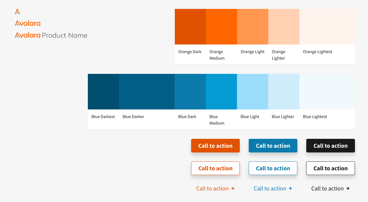
I designed Skylab MX, a scalable design system that powers Avalara.com on AEM Cloud. My work focused on enabling Avalara's global design, development, and content teams to build consistent and accessible digital experiences at scale. This case study highlights how I approached the project with a product design mindset—identifying user needs, designing reusable tools, and validating solutions to improve both internal workflows and customer-facing experiences.
As one of two designers leading the effort, I:
- Partnered with designers, developers, and PMs to identify gaps and opportunities in Avalara's component ecosystem.
- Designed, tested, and documented scalable components to meet real user needs.
- Improved adoption by training designers in Figma workflows and usage guidelines.
- Advocated for accessibility and responsive design to ensure inclusive experiences across regions.
- Established processes for version control and change management, reducing friction in rollout and adoption.
- Empower internal teams: Provide Avalara's global design and content teams with flexible, reusable components that reduce redundant work and speed up page build creation.
- Enhance customer experience: Deliver consistent, accessible, and performant pages that improve how customers engage with Avalara's content and tools.
- Align with core design principles: Extend Avalara's product design system (Skylab) into marketing, ensuring consistency and alignment across product and web experiences.
- Build for scalability: Establish a system that grows iteratively with new use cases, from foundational atoms to interactive tools like the Tax Calculator.
Avalara.com was built from a collection of isolated AEM components without a shared structure or guidelines. This created challenges for both internal users (designers, developers, marketers) and external users (customers visiting the site):
- For internal users: Inconsistent patterns made it slow to build new pages, difficult to maintain components, and confusing for designers across global teams to know which patterns to use.
- For external users: The lack of consistency led to usability issues, accessibility gaps, and performance inefficiencies that negatively impacted the customer experience.
How might we design a scalable system of components that enables Avalara's teams to build efficiently, while ensuring a consistent, accessible, and engaging experience for customers?
Avalara's product team had already established Skylab, the core design system used within Avalara's SaaS products. However, Avalara.com—the company's most visible customer-facing platform—was still built on fragmented, legacy AEM components that didn't align with Skylab's principles.
Our team within the Digital Experience and Platforms group set out to create Skylab MX (Marketing Experiences), extending Skylab into the web ecosystem. With Avalara migrating from AEM Basic to AEM Cloud, this was a critical opportunity to:
- Align marketing and product experiences under a shared design language.
- Streamline workflows for global designers, developers, and content authors.
- Improve scalability and maintainability by consolidating two design systems (Legacy DXD + Skylab MX) into a single, cohesive foundation.
The long-term vision: unify Avalara's digital ecosystem so whether a user is in-product or on Avalara.com, they experience a seamless, consistent, and accessible interface.
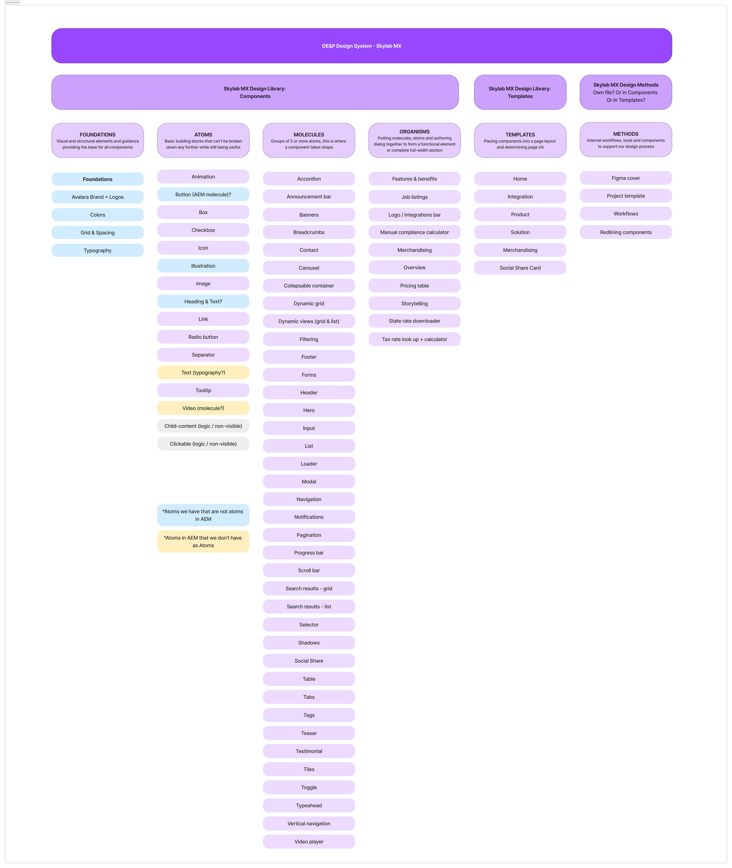
We audited what the Skylab MX Design Library would consist of. This updated documentation helped us communicate better with our engineering and PM partners.
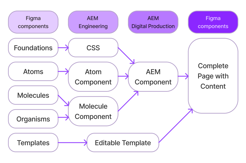
Foundations
Visual and structural elements and guidance providing the base for all components.
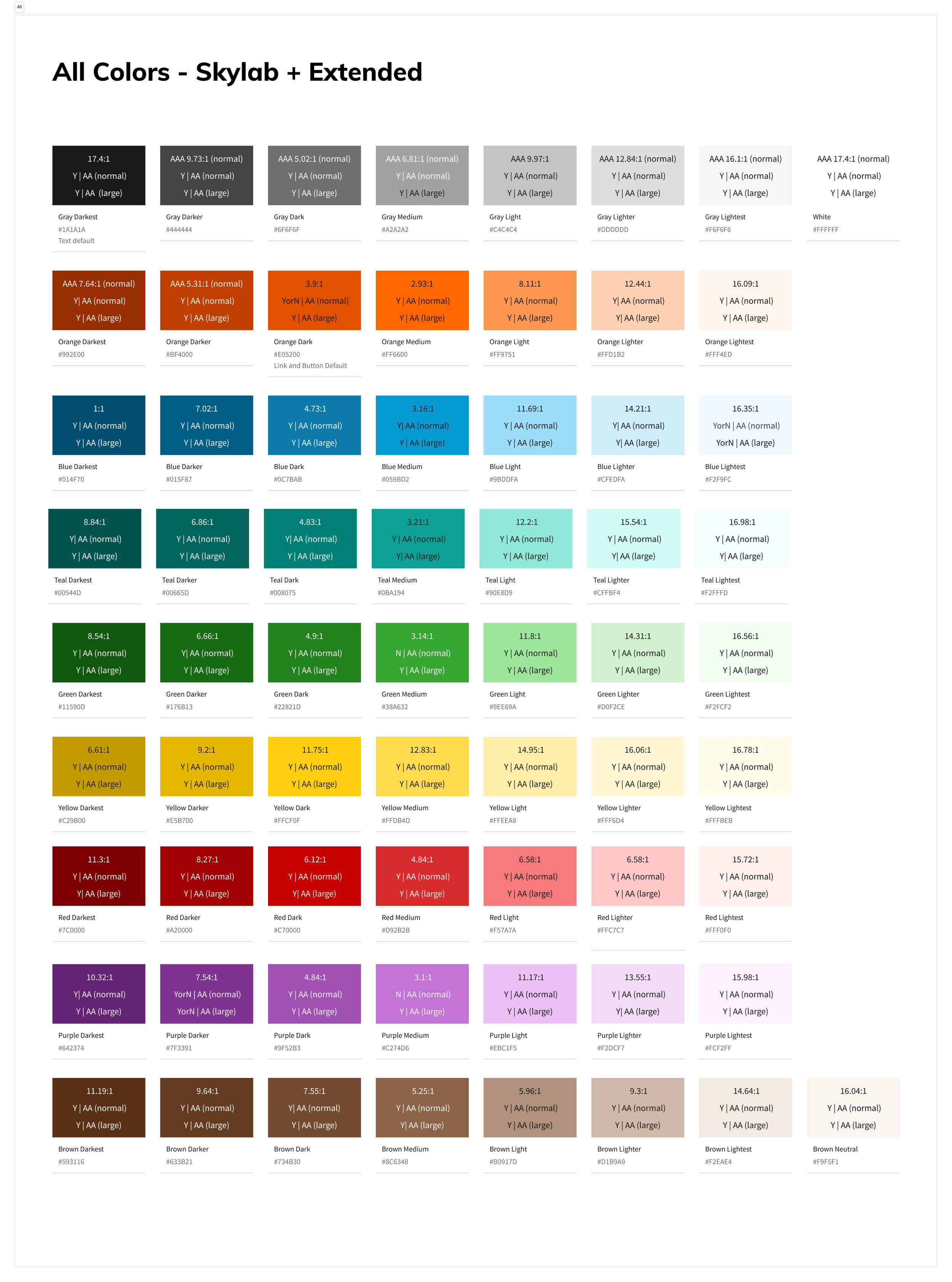
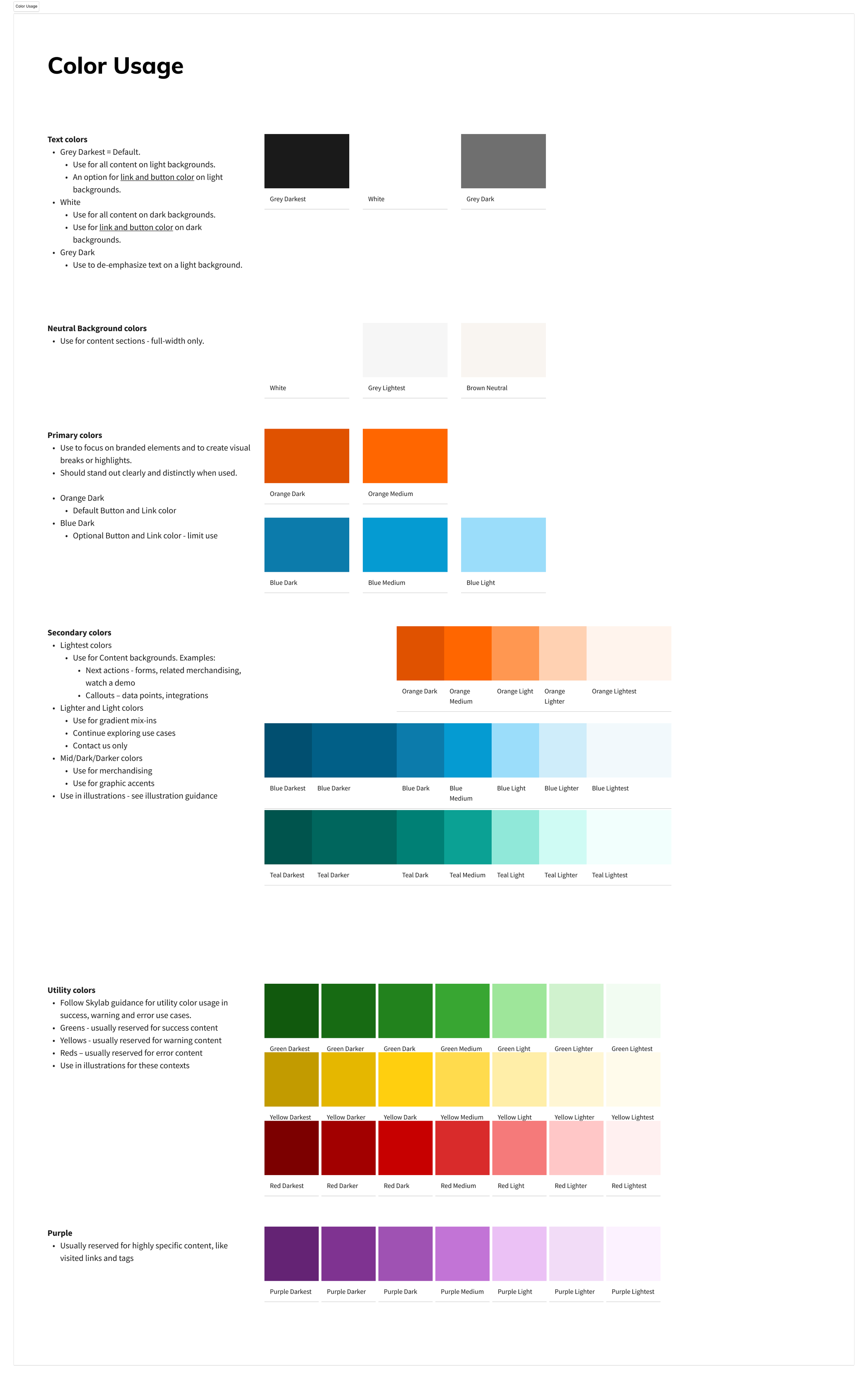
Color
We were able to expand Skylab's color palette to give us flexibility in our visual assets across the site.
Spacing
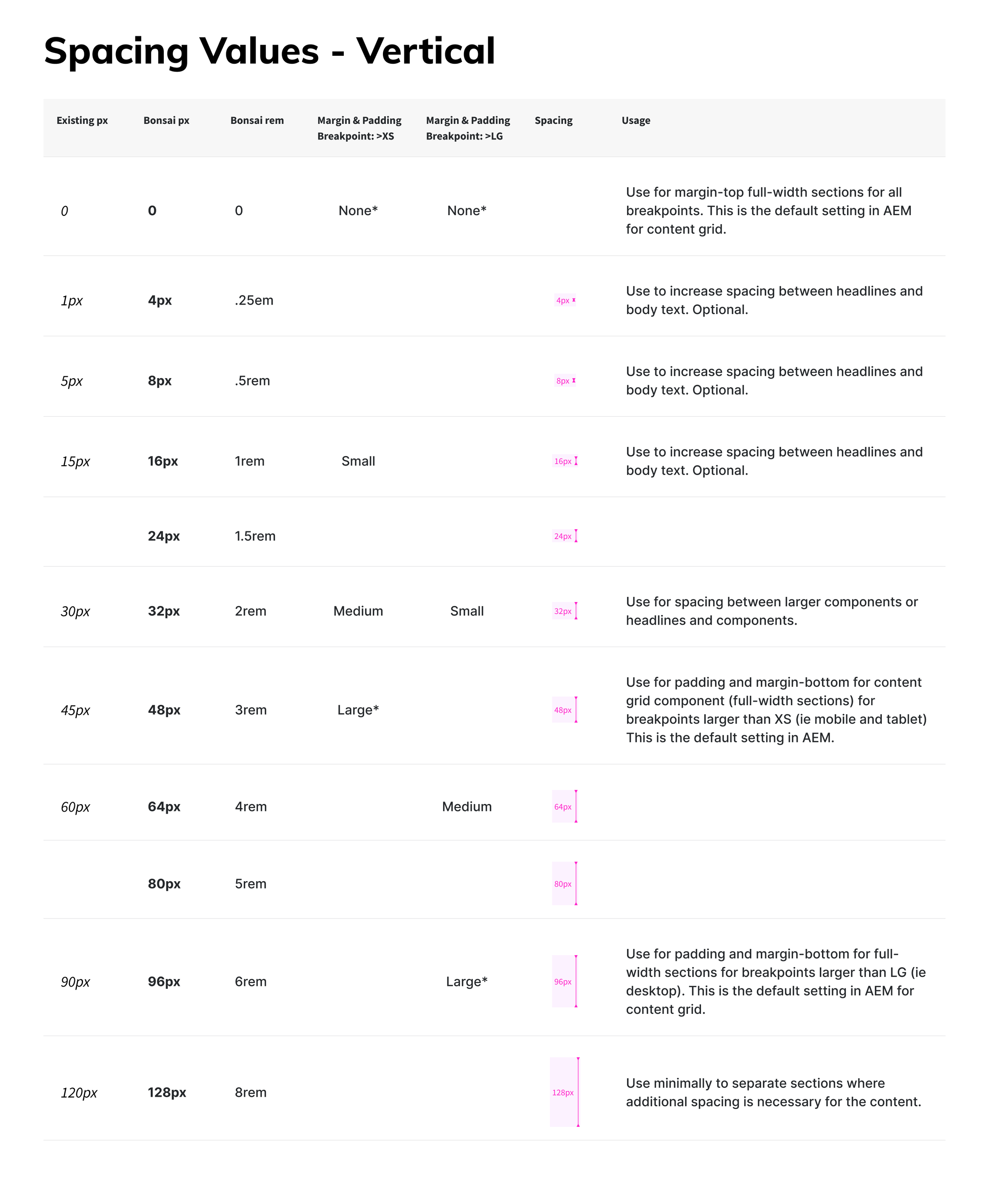
Consistent spacing is essential for creating clear, readable layouts that guide users through content efficiently. Avalara's original system used a 4px hard grid tailored for table-heavy product interfaces, but marketing pages required more flexibility to accommodate diverse content types such as images, videos, text blocks, and forms.
For Skylab MX, we implemented:
- An 8px base grid with a soft grid overlay, allowing components to scale naturally while maintaining alignment.
- Flexible spacing rules that support accessibility, ensuring that containers expand proportionally when users increase text size or zoom in on the page.
- Consistent vertical rhythm and padding patterns, which improve readability and visual flow across complex page layouts.
By aligning spacing with both design consistency and user needs, we improved usability (clearer content separation), readability (comfortable visual hierarchy), and accessibility (layouts that adapt to different devices and user settings).
Typography
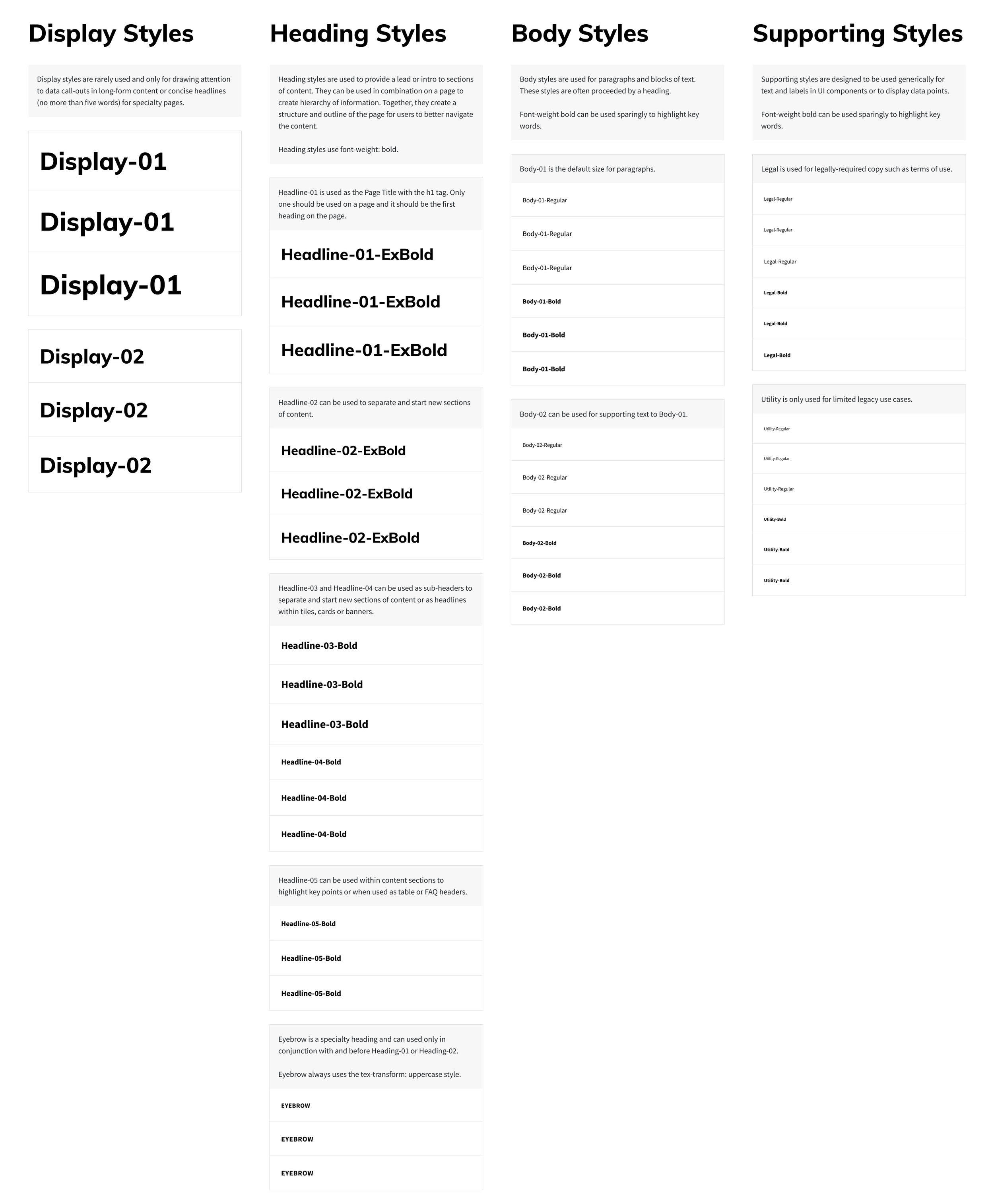
Skylab's core typography was originally designed for in-product use, where smaller font sizes improve readability in dense interfaces such as data tables and detailed interactions. For Avalara.com, however, users interact with longer-form content and need to quickly skim for key ideas.
To support this, we adapted the typography for Skylab MX by:
- Scaling font sizes upward with larger steps between sizes, improving readability and making key messages easier to scan.
- Using a modified Major Third type scale to establish consistent hierarchy, helping users visually distinguish headings, subheadings, and body text.
- Optimizing line-height (≈ font size × 1.5) and fine-tuning extremes (very large and very small text sizes) to maintain comfortable reading rhythm across devices.
- Implementing rem-based sizing, which supports accessibility by allowing text to scale seamlessly when users adjust their browser or device settings.
Together, these changes improved usability (clear hierarchy, easier scanning), readability (comfortable rhythm and spacing), and accessibility (scalable typography that adapts to user needs).
Atoms
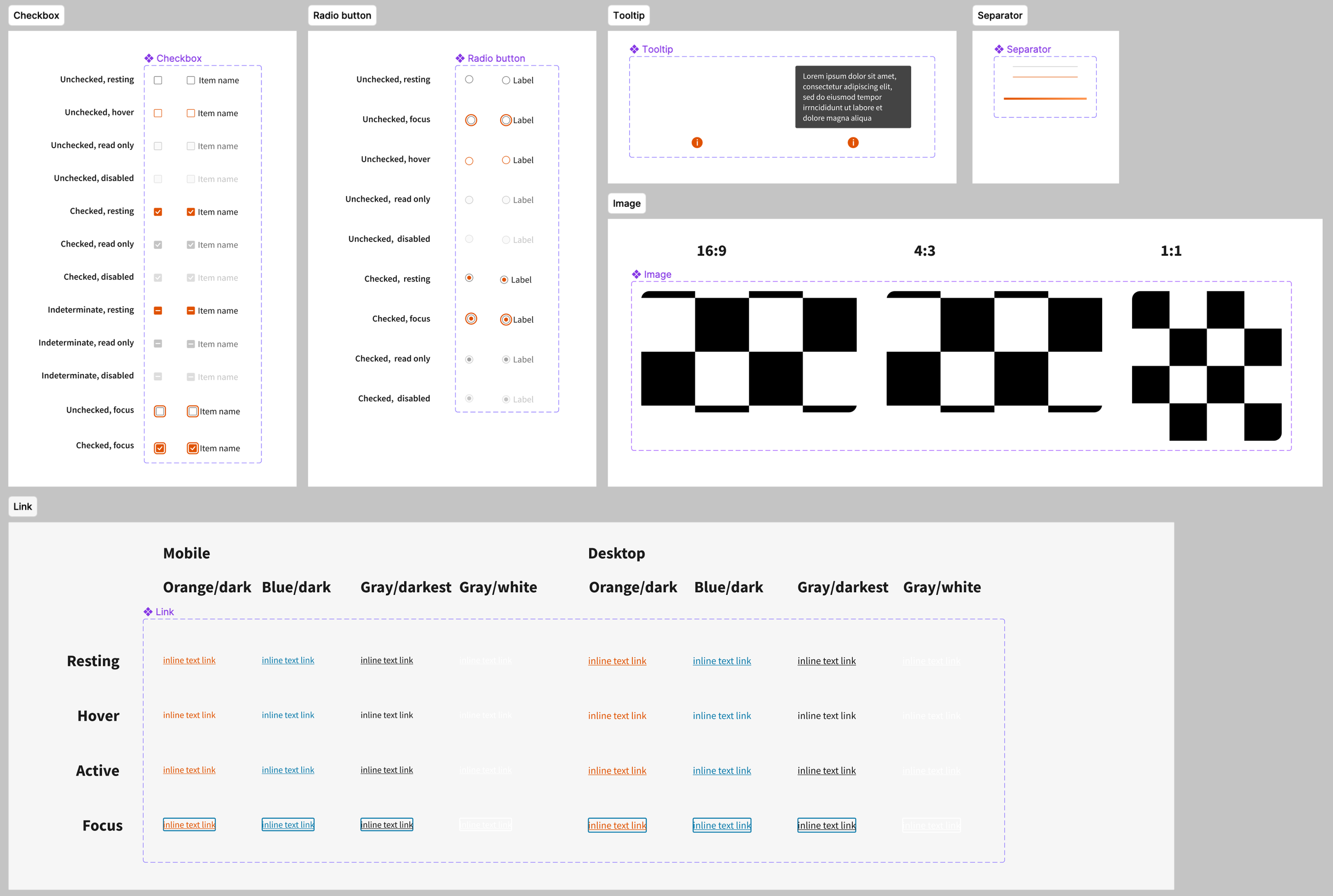
Basic building blocks that can't be broken down any further while still being useful. In Skylab MX, atoms included: checkboxes, icons, images, links, radio buttons, separators, and tooltips.
Molecules
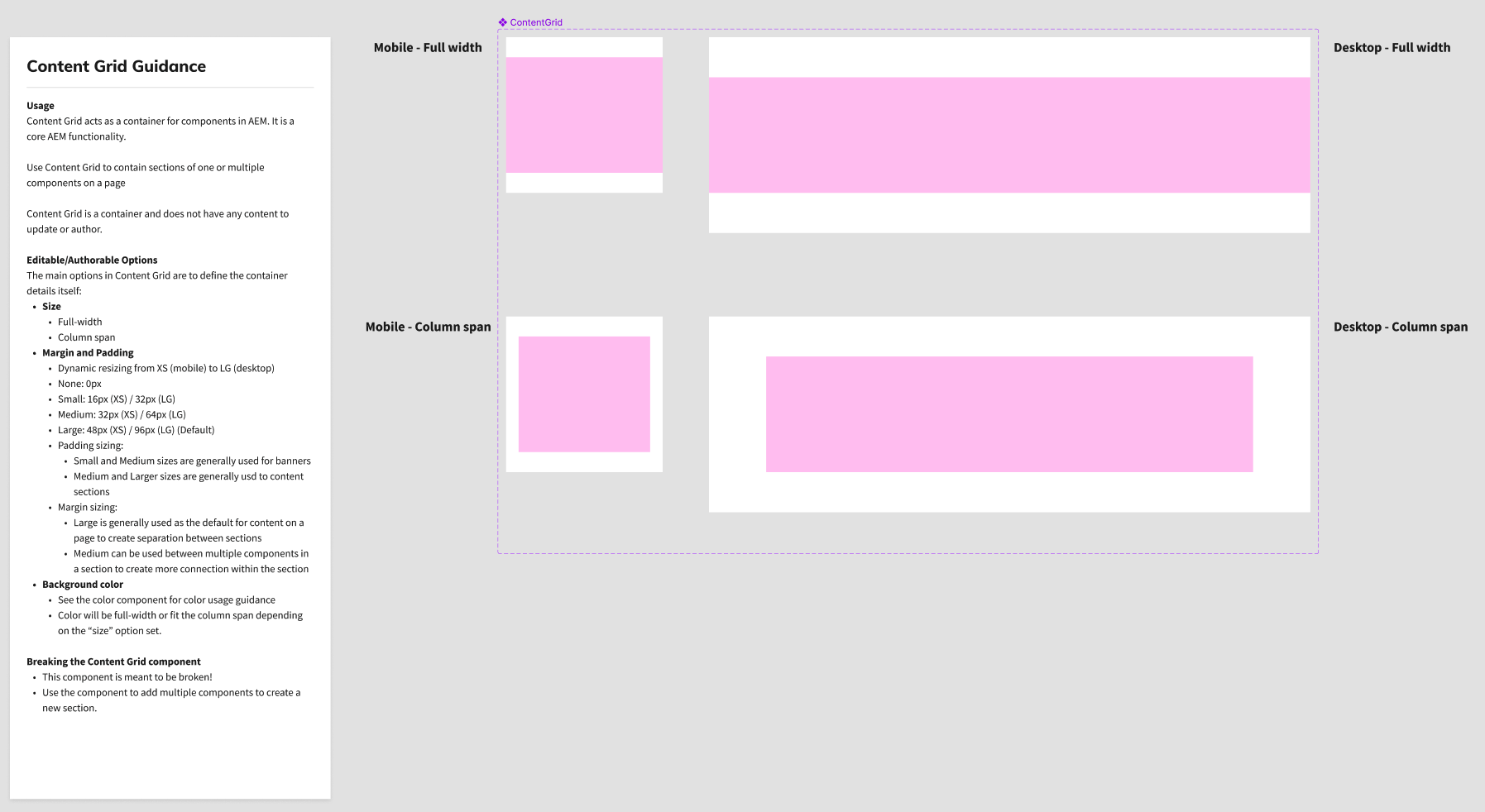
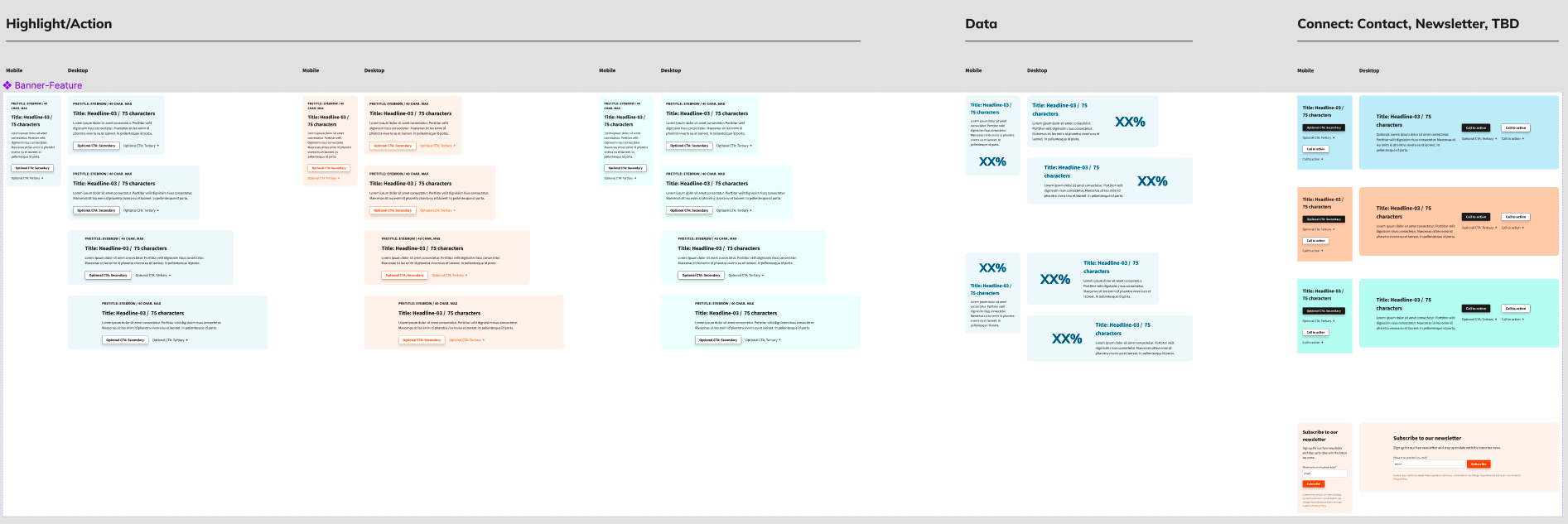
Groups of 2 or more atoms, this is where a component takes shape. This is what the bulk of our design system consists of. Examples in Skylab MX: content grids, feature sections, banners, button groups. After determining these molecules, our digital production team can produce these pages more efficiently, and page load speeds have improved.
Feature guidance
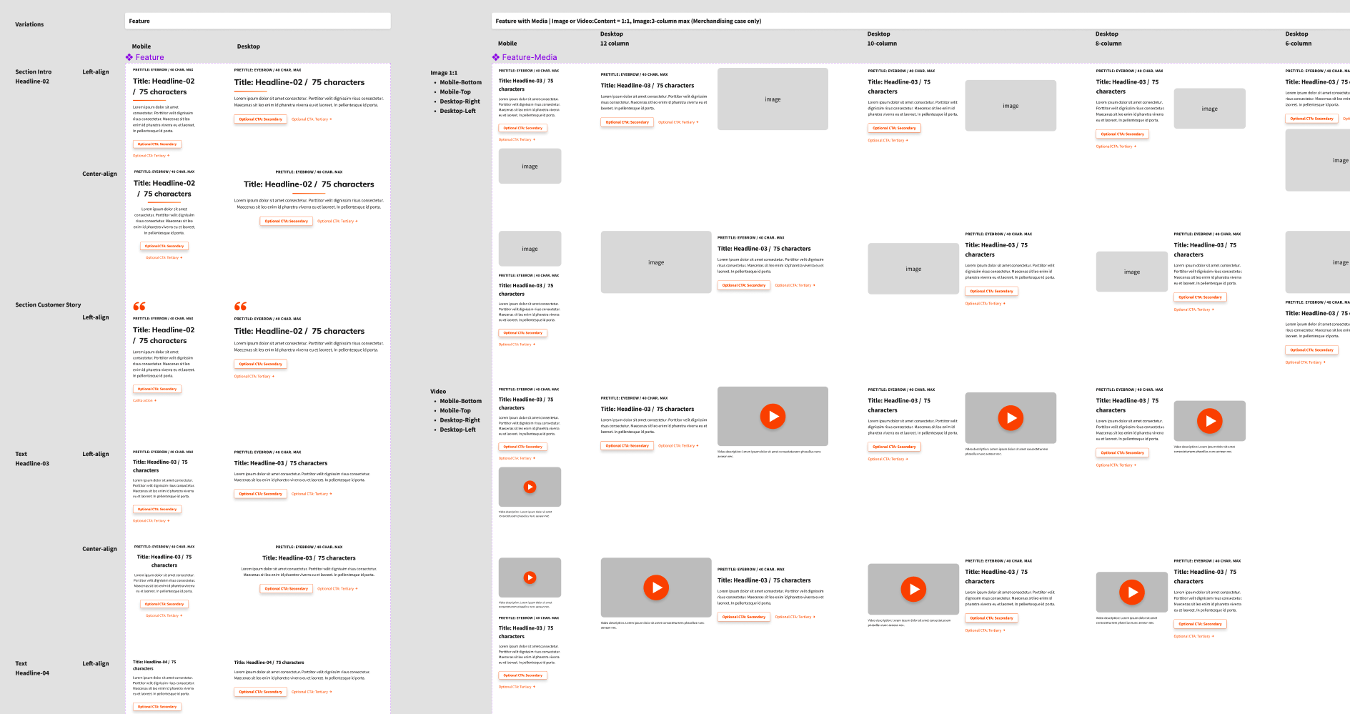
- Usage: Feature is a component used to display a contained content section on a template page. These content sections include: text, images, video, quotes, data callouts, forms, etc.
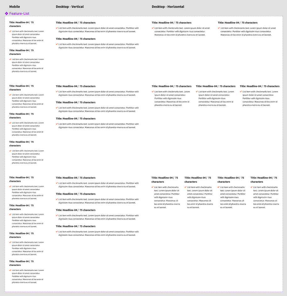
- Feature List: Multiple features can be combined on a page and multiple of the same variation can be used to create a "list" within a section.
- AEM Core Component Base: Feature extends the AEM Core Component called "Teaser".
- Skylab use cases: Skylab does not have an equivalent type of component as there are less long-form content type use cases in the Product.
Banner guidance
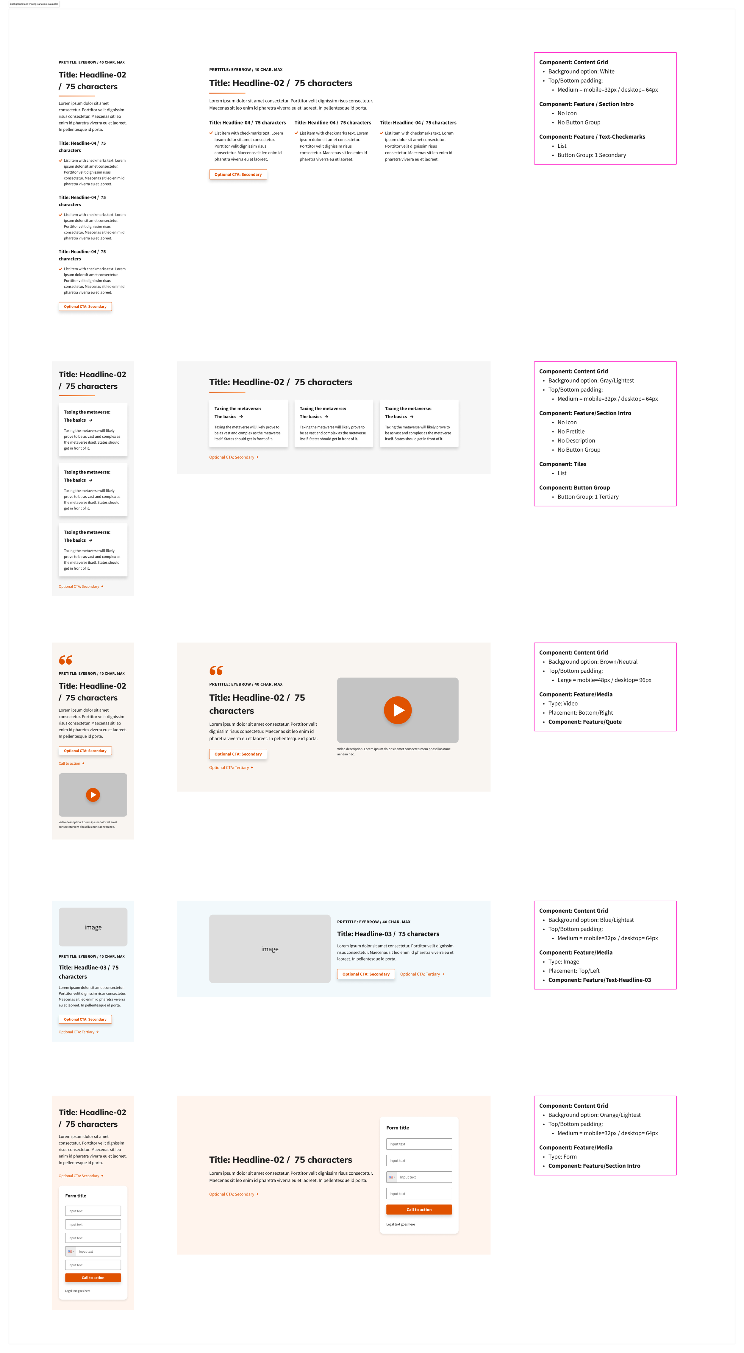
- Usage: Banners can be used to create contained elements to highlight other Avalara content with a background color. Multiple banners can be used on a page.
- AEM Core Component Base: Banner extends the Skylab MX component "Feature." Feature extends the AEM Core Component called "Teaser".
- Skylab use cases: Skylab has two banner types. The Banner in Skylab MX covers marketing use cases that are too different to extend off the Skylab version. Skylab banner examples: Alerts (errors, warnings, success messages) and in-product marketing (similar to merchandising).
Organisms
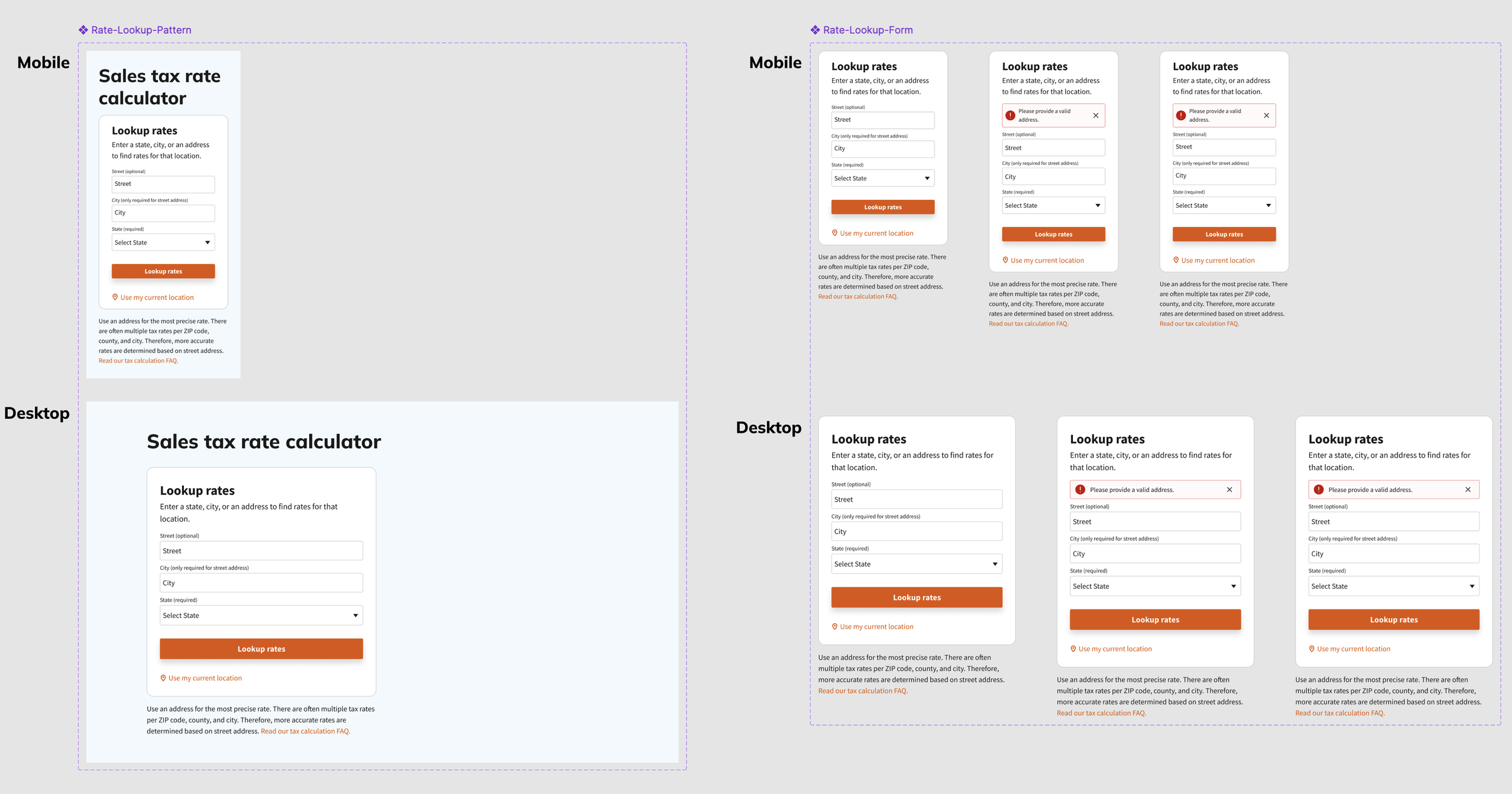
Collections of molecules combined to create a distinct, more complex part of an interface. A highly trafficked organism on our site is our tax calculator. The Tax Calculator is a tool that can be used to determine the tax rate for different locations and then the total amount of an item including tax for specific areas. Customers can search by address, city or state and once the rates are displayed, they can add an item amount to calculate the total. The most accurate way to determine an item's tax rate is by address.
Templates
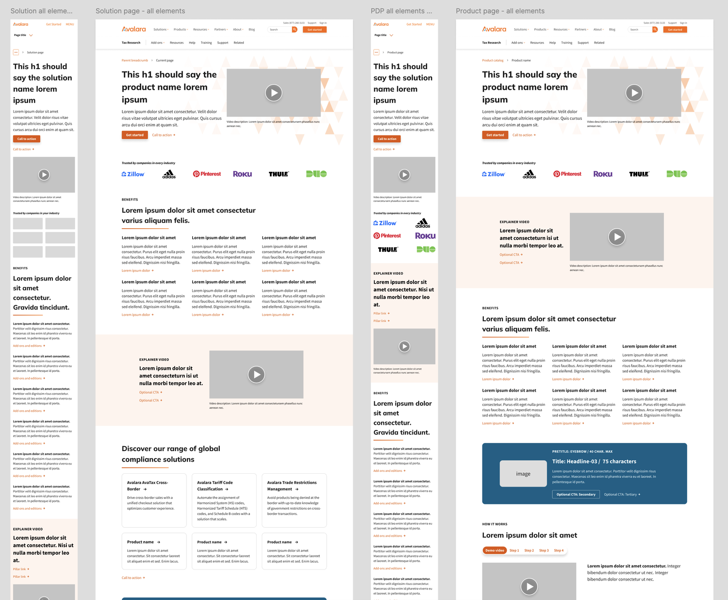
Composed primarily of groups of organisms combined to create full pages, where the design and layout begin to take shape. The core template pages we have started on are the homepage, product, solution, technology integration, rate pages, and blog pages. We have yet to build out additional pages like event, webinar, video, and customer stories.
- Efficiency for internal teams: Designers and content authors can build pages quickly using pre-defined layouts, reducing redundant work and speeding time-to-market.
- Consistency across the platform: Templates enforce visual hierarchy, spacing, typography, and component usage, ensuring a cohesive user experience.
- Flexibility for diverse content: Templates support varying content types—from marketing messaging to interactive tools like the Tax Calculator—while maintaining system alignment.
- Scalable design: As new content types or marketing campaigns emerge, templates can be updated modularly without breaking existing pages.
- A design system is never finished: We began with essential components, which initially made pages feel somewhat plain. However, this iterative approach allowed us to strategically expand and refine the system as new needs emerged.
- Aligning design with AEM's structure: To streamline development and ensure consistency, we structured components in Figma to align with AEM's authoring dialogs, keeping the page builders experience in mind.
- Comprehensive documentation is essential: With a global team, we created detailed usage guidelines in Figma tailored for designers, developers, and page builders. This ensured clarity and alignment across roles and regions.
- Version control is key: By implementing version control in Figma, we could track updates and communicate changes effectively, maintaining consistency and transparency within the team.