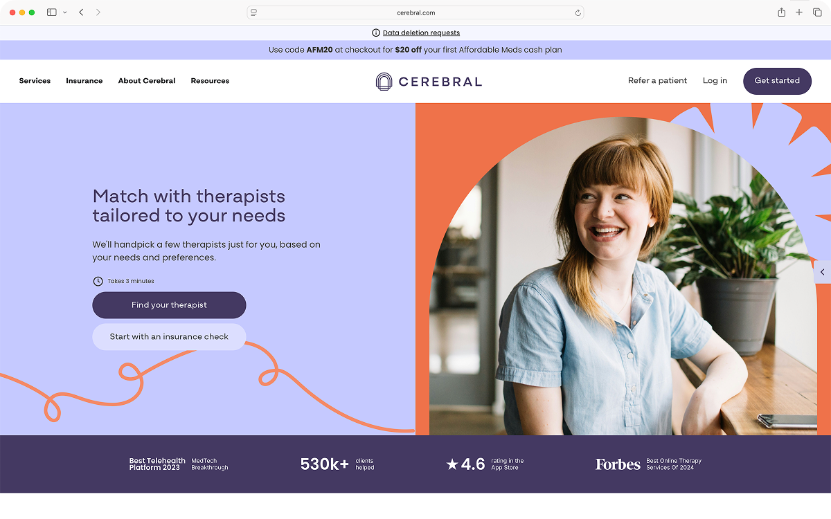
Cerebral is an online mental health platform offering therapy and medication plans. Its search and schedule funnel sent every user down the same path, ready-to-book and still-deciding alike, and it wasn't converting. As the sole designer embedded in the growth pillar, I owned the experience end to end, from landing page to checkout.
People arrive at a mental health platform at very different moments. Some are ready to book. Some are still deciding whether they need help at all. Cerebral's search and schedule funnel sent all of them down the same path, asking for the same commitments in the same order, and it wasn't converting.
Cerebral is an online mental health platform offering therapy and medication plans. As the sole product designer embedded in the growth pillar, I owned the end-to-end UX of the full-funnel conversion experience, from landing page to checkout. My mandate was to design and iterate on experiences that moved users through the funnel more effectively, working closely with a product manager, engineering, and marketing in a lean, fully remote team.
Behavioral data and session recordings pointed at four problems:
- Steepest drop-off at the payment screen. Heap exit analysis pointed to a value gap, not a price objection.
- Hesitant users bounced between screens with no guidance and no path of their own.
- High-intent and low-intent traffic ran the identical flow.
- Too many mandatory steps, none of them earned before the ask.
Behavioral data and session recordings surfaced a consistent picture. Four things stood out, and discovery would later prove one of them wrong:
- Users were dropping off at the payment screen at a disproportionate rate. Exit analysis in Heap pointed to a value perception gap, not a price objection. The case for the cost of a session hadn't been made yet.
- A meaningful segment of traffic showed hesitation patterns early in the funnel, bouncing between screens and exiting without taking action, suggesting users weren't sure what type of support they were looking for, yet the funnel offered no guidance or branching for this group.
- The funnel treated high-intent and low-intent users identically. A user ready to book an appointment and a user still exploring their options were sent down the same path.
- Getting to a scheduled appointment required too many clicks. Every mandatory step — account creation, insurance verification, credit card capture — was a potential exit point, and the funnel wasn't doing enough to justify each ask before making it.
These weren't UX problems. They were growth problems, distributed across the whole journey.
These weren't just UX problems, they were growth problems. The friction wasn't concentrated in one place; it was distributed across the entire journey. Solving it required both qualitative insight into what users were telling us, and quantitative discipline around where exactly they were leaving and why.
We audited nine mental health platforms with a researcher from CoLab, alongside SEMrush performance data and Tracksuit brand tracking.
Two findings mattered. Shorter funnels don't convert better — the top performers ran 25 pages or more. And Cerebral ranked second lowest in trust in its category. Together they reframed the work: the problem wasn't length, it was what we asked for and when.
Before designing, we partnered with a user researcher from CoLab to conduct a competitive audit of nine mental health platforms, examining what high-performing conversion funnels actually looked like and where Cerebral had room to improve.
What we looked at: conversion flow audits across Talkiatry, BetterHelp, Grow Therapy, Talkspace, Thriveworks, Rula, Headway, LifeStance, and Alma, each reviewed end-to-end as a user seeking talk therapy for moderate anxiety. We also pulled web performance data via SEMrush and brand tracking data via Tracksuit.
The most important finding flipped one of our early assumptions. Shorter funnels don't convert better. The top performing competitors had flows that lasted 25 or more pages, and there is a positive correlation between longer flows and higher purchase conversion rates. That meant our problem wasn't the length of the funnel; it was what was happening inside it.
Brand tracking data from Tracksuit added a sharper edge to that finding. Cerebral ranked second lowest in trust among its competitors. In a category where users are making decisions about their mental health care, trust isn't just a brand metric; it's a conversion metric. Users weren't failing to find Cerebral. They were finding it and not feeling confident enough to commit.
Talkiatry led in purchase conversion rate despite having one of the longest flows. They deliberately removed friction and built trust at every step. Long flow, low friction, high trust. And it converted.
The goal wasn't to shorten the funnel. It was to earn each step.
The audit reframed our design mandate. The goal wasn't to shorten the funnel or remove steps. It was to earn each step, reducing friction where it was painful and building trust where users were uncertain. The question we kept coming back to was: at every point in this flow, does the user feel like we know them and are trying to help them?
Sole product designer across the full funnel. Partnered with the PM, engineering, marketing, a CoLab researcher, and a content writer. Discovery through developer handoff and post-launch iteration.
Sole product designer across the full conversion funnel. I worked in close partnership with the product manager and engineering team, and collaborated with the one other product designer on the team for cross-functional design alignment. I partnered with marketing when we introduced consultations into the funnel, and with a content writer once one joined the project to refine the intake copy. I was responsible for discovery, competitive audit, and design exploration; UX flows and high-fidelity Figma prototypes; first-pass content and flow drafting using AI tooling; translating design decisions into rapid iterations based on what we observed; and developer handoff, QA, and continued iteration post-launch.
Two things shaped the work. Engineering moved one two-week sprint at a time, so I used the trust findings to argue for sequencing rather than scope. And we didn't have time to run experiments, no A/B tests, so decisions leaned on competitive evidence rather than our own.
Engineering capacity, and making the case for urgency
This is where I spent the most energy. I wanted as much of the redesign as possible in the initial updates, because the problems we'd found were compounding, and shipping a little at a time meant users kept hitting the same friction while we waited. But the team moved in two-week cycles and could take on one sprint's worth at a time. The intake-to-filters connection in particular carried real backend complexity that engineering flagged early and correctly. I also worked within the existing component library rather than designing net-new patterns, which kept lift down and let us spend the sprint on flow logic and copy.
The discovery data was my leverage. The trust finding was the strongest argument I had: if users were already arriving skeptical, then every sprint spent shipping partial improvements was another sprint where the funnel kept asking for commitment it hadn't earned. That reframed the conversation from "which features fit in this sprint" to "what's the cost of waiting." It didn't get me everything at once, but it moved work up the queue and changed how the team weighed it.
Where the answer was no, I looked for a version that fit. The clearest case was AI-powered matching, which I wanted and couldn't have because the tooling wasn't in place. The need it was meant to serve, users who arrived interested but undecided, got solved with people instead: a free 15-minute consult with a Care Coordinator.
Evidence without experiments
We didn't have time to run experiments. Every change went out to all traffic at once, and we read the funnel week over week. On top of that, marketing spend kept fluctuating.
We leaned on the audit done with CoLab, which gave us live performance data on platforms that were demonstrably converting better than we were, and the correlation between longer flows and higher purchase conversion came out of that data rather than out of a hypothesis we'd formed and then tested. When I argued for a decision, the case was "here is what's working for competitors outperforming us, and here is why it applies to our users," not "here is what our test showed."
A correlation observed across competitors isn't causation for us, and it's possible the platforms running longer flows simply had more brand equity to spend on user patience. What made me confident enough to act on it was that the pattern lined up with a second, independent signal: our own trust ranking. Both pointed at the same conclusion, that the problem was what the funnel was asking for and when, not how long it was.
1. Personalized funnel experiences by user type
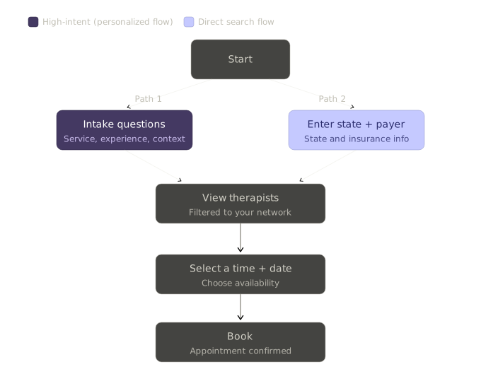
The funnel wasn't too long, it was undifferentiated. I split the entry point into two paths by intent: high-intent therapy users ready to book, and low-intent users who weren't ready to commit, and needed to see what they'd actually get — which therapists were in-network for them — before they did.
The funnel wasn't too long. It was undifferentiated. A user ready to book and a user still deciding whether they needed therapy were being asked for the same commitments in the same order. Optimizing that single path would have meant compromising for both groups: shortening it would strip out the reassurance hesitant users needed, and lengthening it would add friction for users who were already sold. The only way to reduce friction for one group without removing value for the other was to stop treating them as one audience.
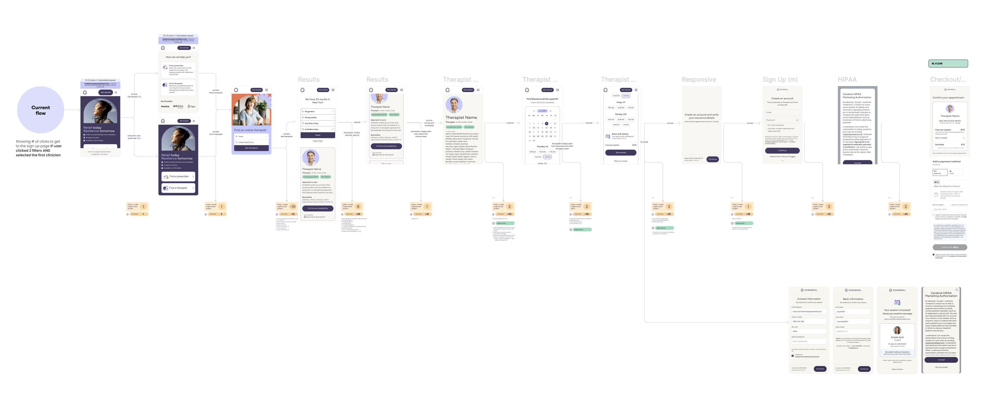
Two paths, split by intent. I redesigned the funnel entry point to route users into tailored experiences: high-intent therapy users ready to book, and low-intent users who needed more guidance before committing. For that second group, the path led with what they'd actually get: a fast route to seeing which therapists were in-network for them, before any ask for an account or payment. Each path was designed to surface the right information at the right moment, reducing unnecessary friction for users who were ready, and providing reassurance for users who weren't. Medication had its own entry point, and Heap showed little crossover between the two audiences. The medication add-on also surfaces later, after a user has booked.
2. Pre-signup intake questions
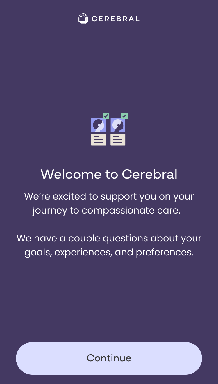
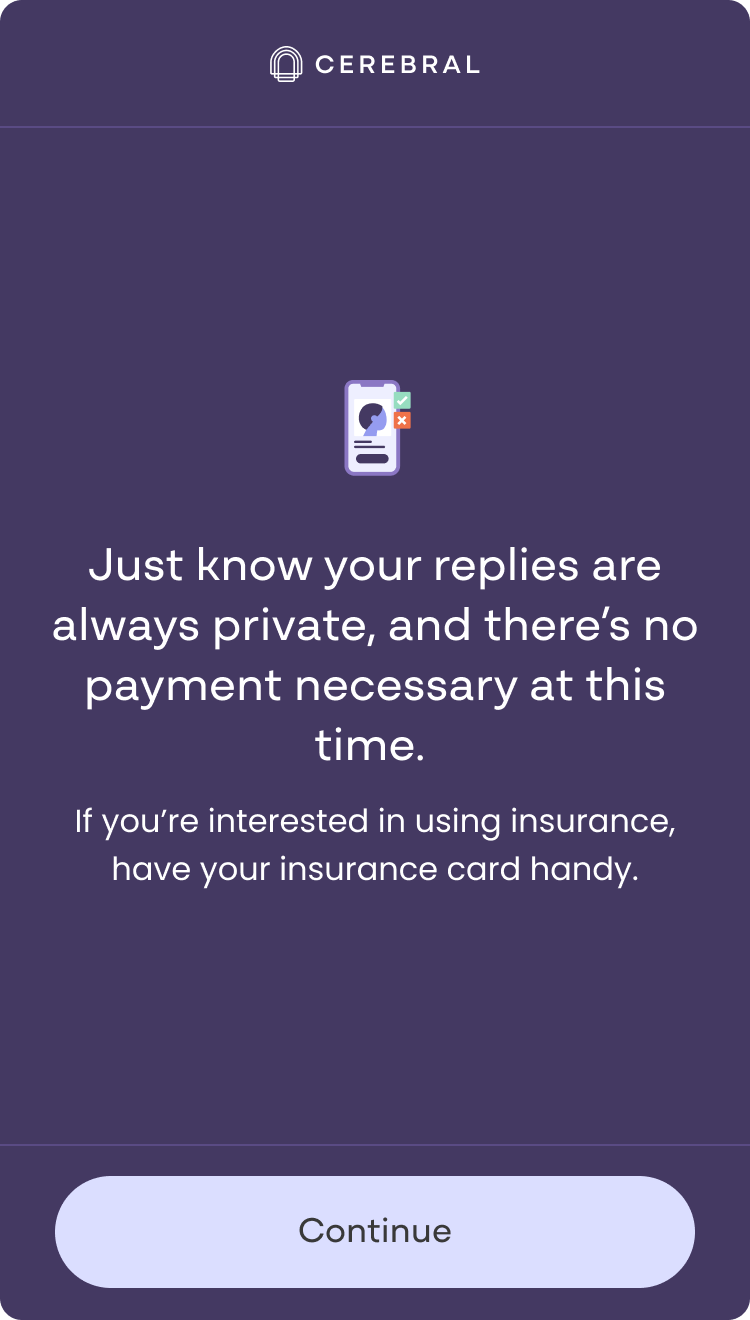
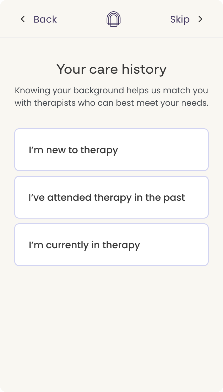
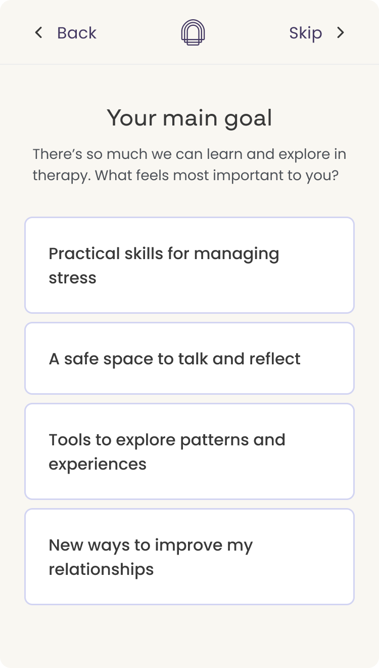
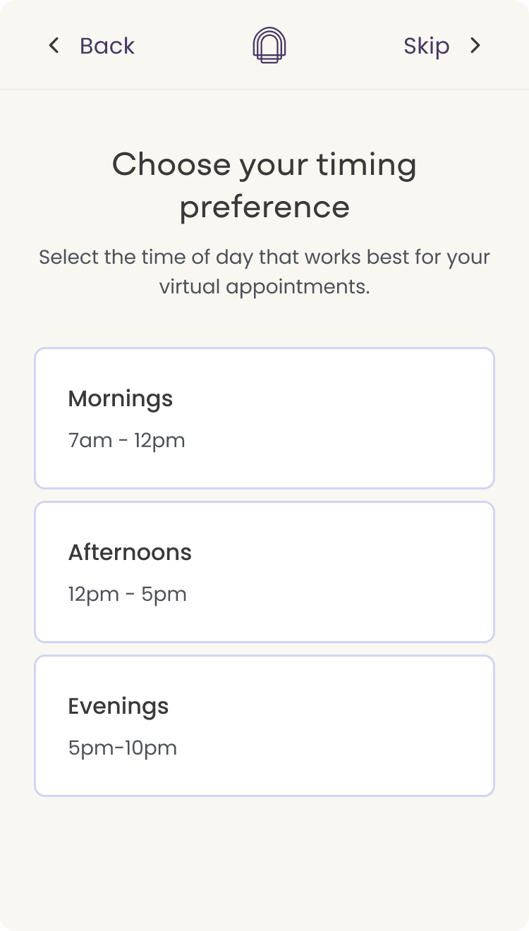
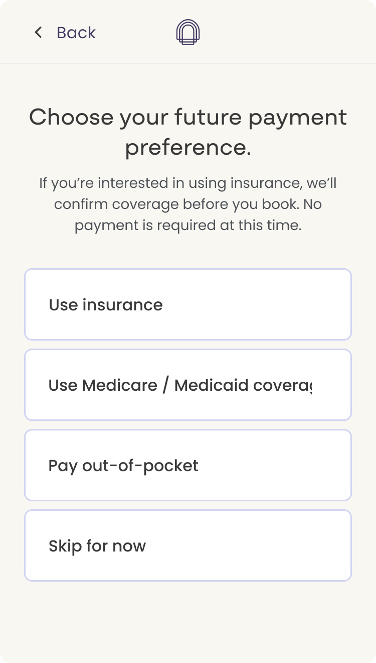
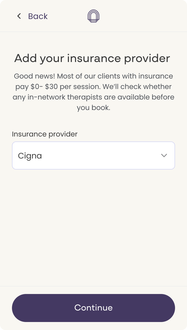
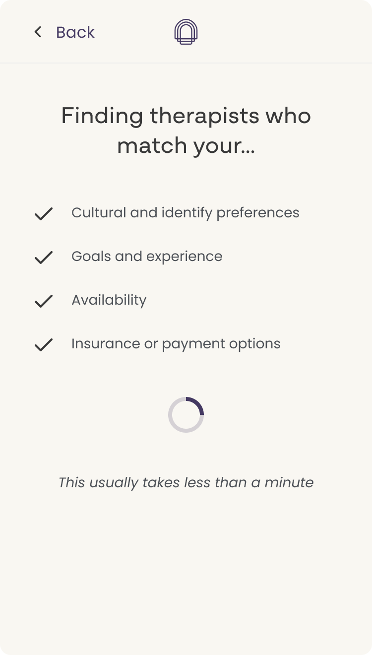
Users needed to feel known before they'd commit. Two opening screens set expectations and addressed privacy and payment anxiety before any questions began. I drafted the question sequence with AI, then a content writer refined the tone into what shipped.
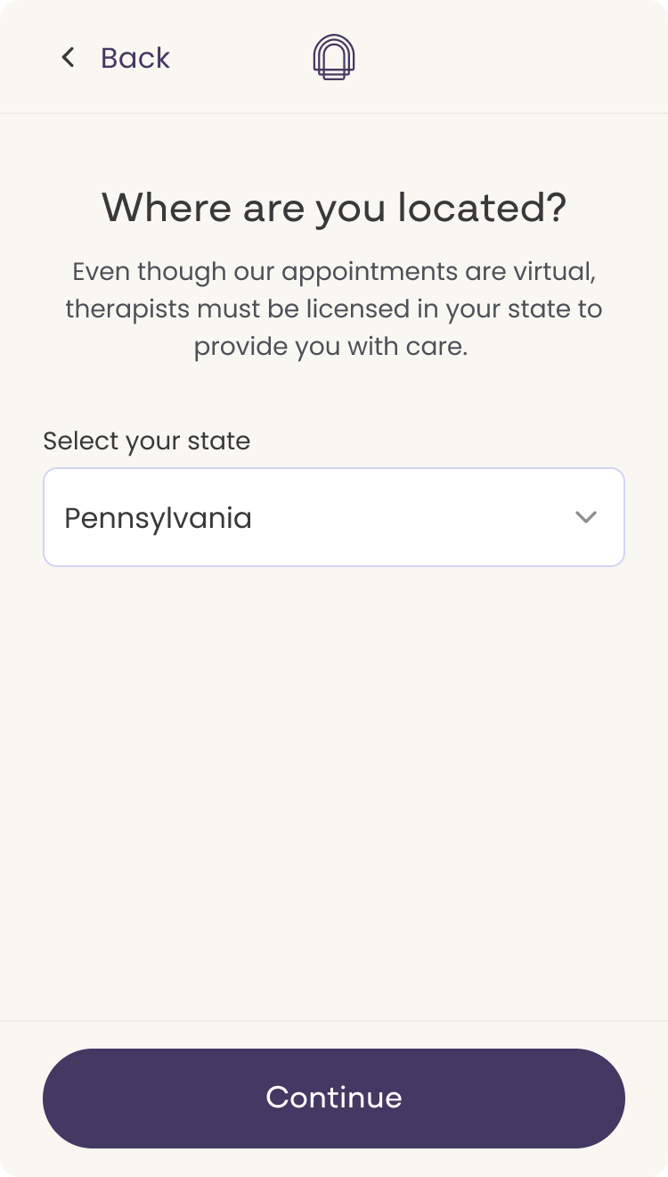
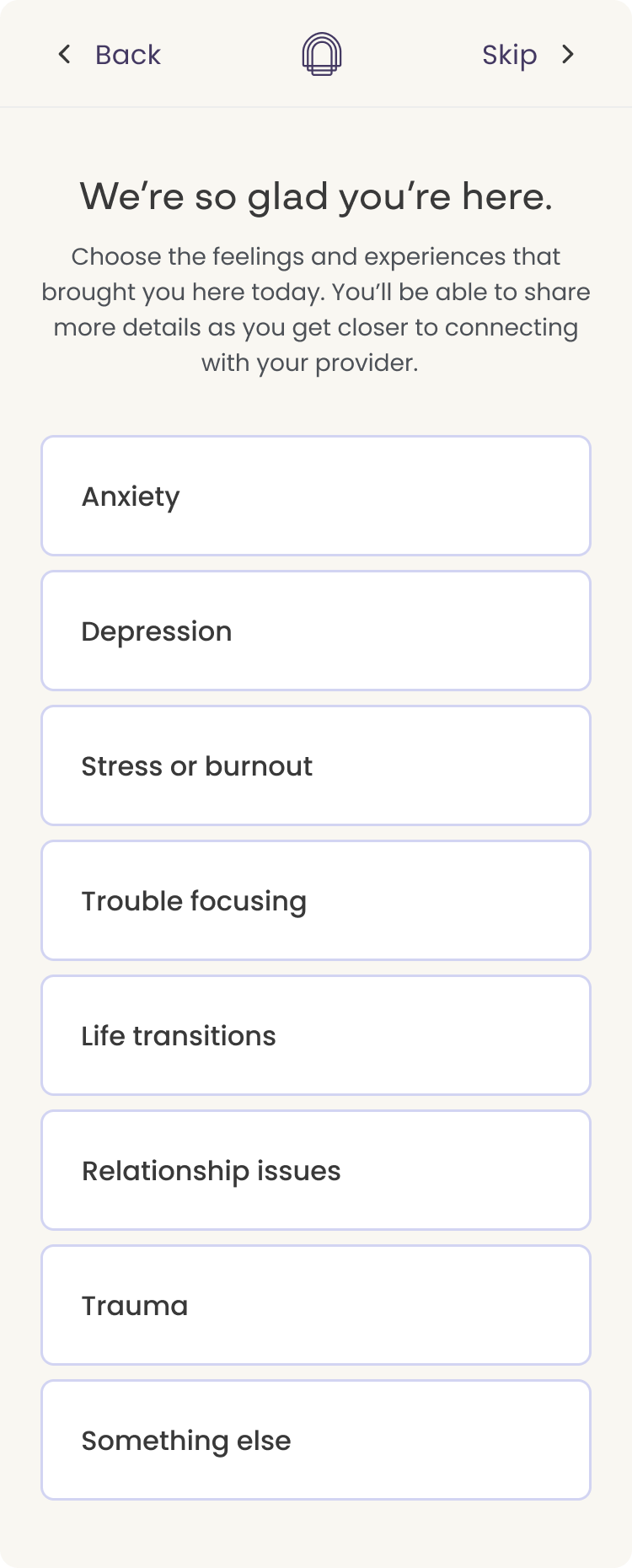
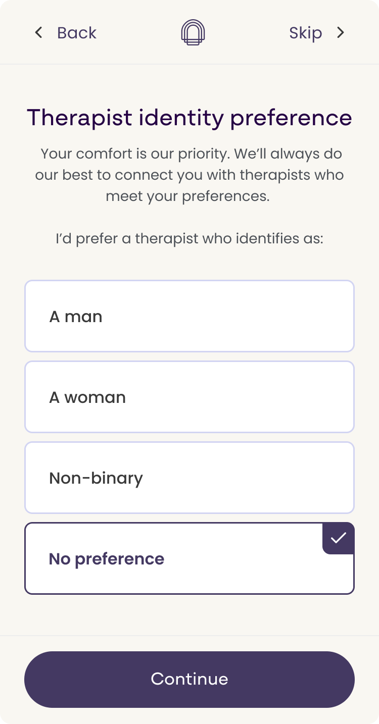
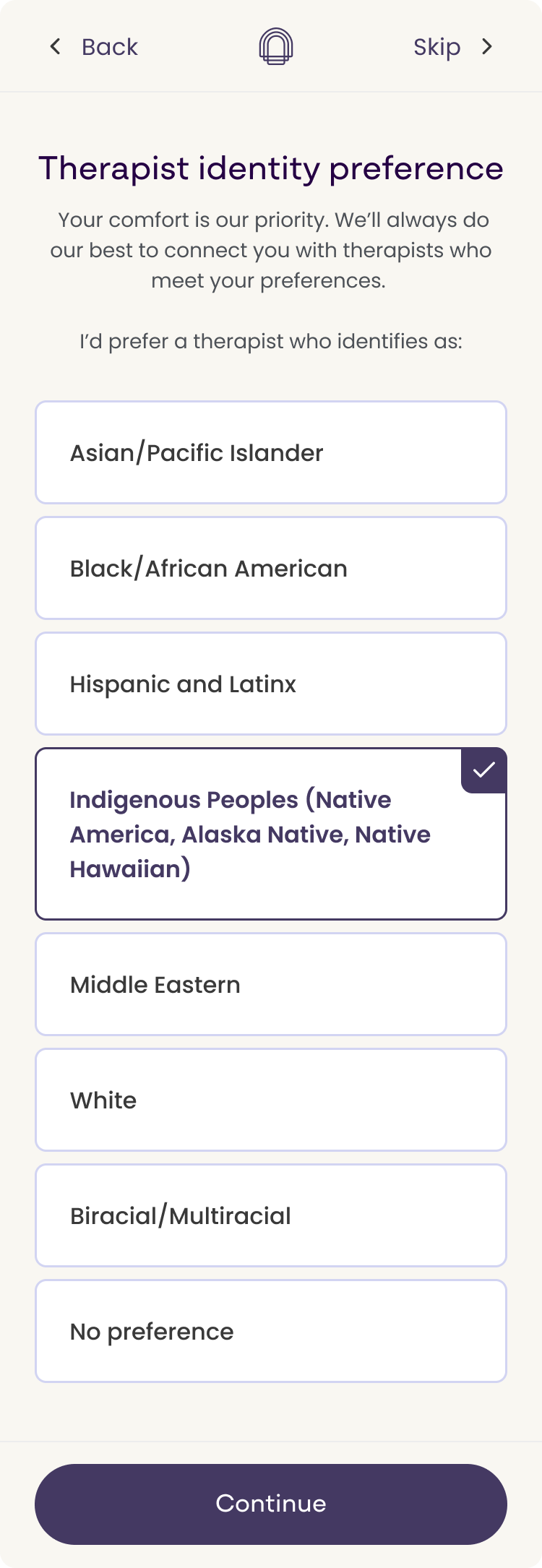
Then intake questions, surfaced upfront with a skip option, fed straight into pre-selected filters on the therapist results page. One question, “What is your main reason for seeking care?”, pre-selected the specialty filter. Users tell us what they need, and the results screen reflects it back.
Users needed to feel known before they'd commit. The clearest way to do that was to ask better questions earlier, but first we had to earn the right to ask them.
Two screens to earn the right to ask. I positioned them before the questions began. Rather than dropping users straight into a questionnaire, these screens set expectations, addressed anxiety upfront around privacy and payment, and gave users permission to continue with confidence. Of everything I designed, these screens were the most direct response to the trust finding.
AI got me to a first draft. Working solo on a two-week cycle and without a content writer yet, I used ChatGPT, Claude, and Figma Make to rough out the question sequence and generate phrasing options for each one. That first pass was never close to shippable. Most of what came back was too clinical and too transactional for people who might be asking for help for the first time, which is exactly the tone problem discovery had told us to avoid. But editing something is faster than generating it, and it meant my time went to the decisions that actually required judgment: which questions earned their place in the flow, what order reduced anxiety rather than adding to it, and how each answer would visibly map to something the user saw on the next screen.
Then a content writer took over. Once we were able to bring one onto the project, they took that draft and refined the tone and wording into what shipped. AI got us to a working version fast enough to keep the sprint moving. The content writer made it sound like it came from a company people could trust.
Filters belonged upfront, not buried. I advocated for surfacing the filtering questions as their own distinct moment in the flow rather than on the results page. My reasoning was that users who arrive at a therapist results page without any prior context tend to get overwhelmed and disengage rather than explore the filters. By asking those questions earlier, with the option to skip, we gave users a moment to stop and think about what they were actually looking for, and signaled that Cerebral had options to meet those needs. Scoped down to its narrowest form, answers fed directly into pre-selected filters when users arrived at therapist results, making the funnel feel like it was paying attention and building an experience around them specifically.
One question proved the thesis. While the CoLab research was still running, we added a single question to the top of the flow: "What is your main reason for seeking care?" That one answer pre-selected the specialty filter on the therapist results page. One question, one filter. But it was the whole thesis in miniature, and it gave me something concrete to point at when I argued for the fuller intake experience: users tell us what they need, and the results screen visibly reflects it back.
What I didn't get to ship. I explored affirmation screens mid-flow, designed to emotionally ground users who might be feeling overwhelmed. Something as simple as surfacing a message that normalizes the experience, acknowledging that many people go through this and that Cerebral is there to help, addresses the trust gap more directly than any structural change. That remains part of my vision for the next iteration.
3. Clinician selection and scheduling
The therapist page wasn't broken, it just wasn't working hard enough. I reworked the card to surface what mattered upfront and replaced the separate scheduling page with a side sheet, so users could evaluate and book without leaving the screen.
Not broken, but not working hard enough. The original layout wasn't using space effectively, and viewing available appointment times required navigating to a separate page, interrupting momentum at a critical decision point.
The redesign kept users in context. I reworked the therapist card layout to surface more relevant information upfront and replaced the separate scheduling page with a flyout showing available dates and times inline. Users could evaluate a therapist and book without ever leaving the selection screen.
Answers became filters. The intake responses from earlier in the flow mapped directly to pre-selected filters on this page, reinforcing the feeling that the experience was built around each user specifically.
Designed vs shipped
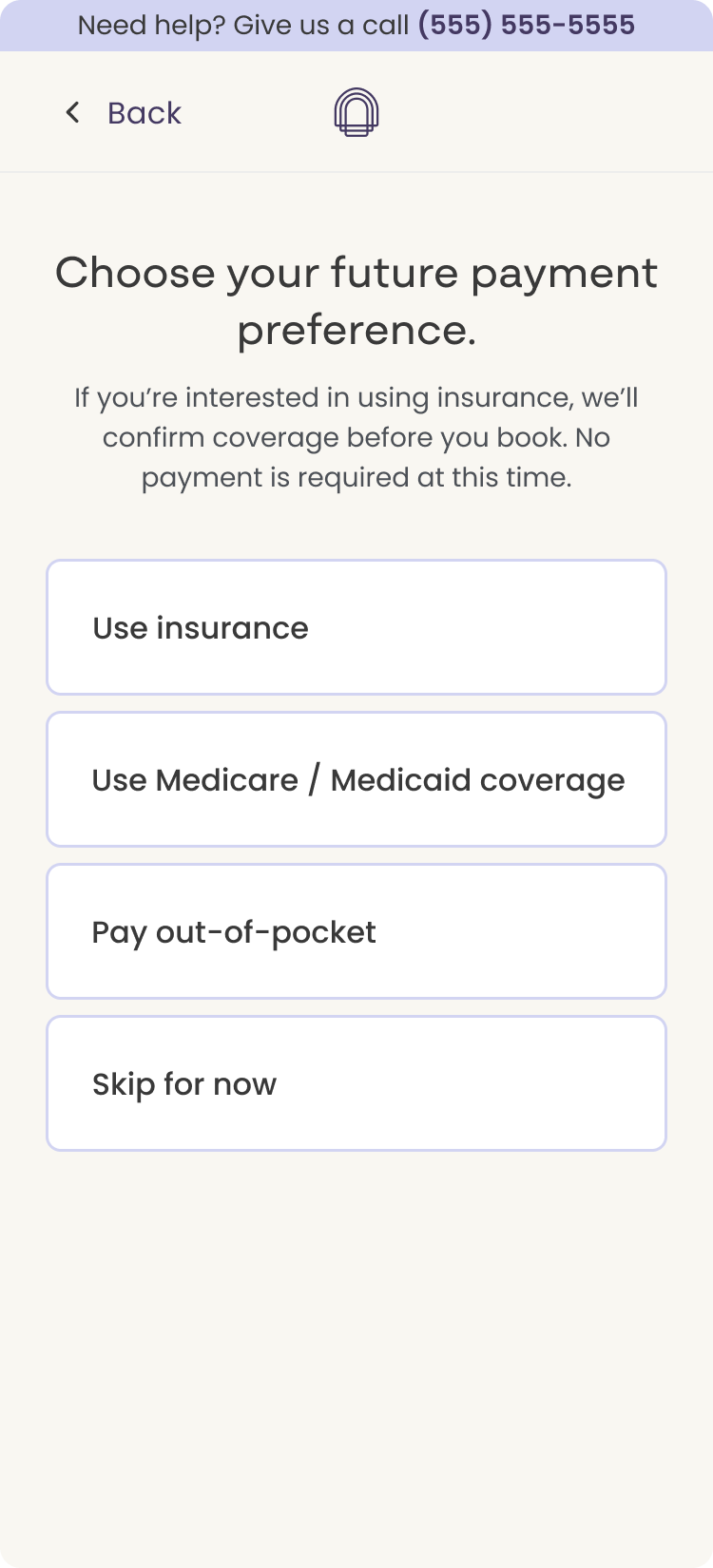
The consult needed a home in the flow, and leadership wanted it added. I explored four placements: a persistent banner, a contextual prompt at the payment question, and two versions of an explicit fork.
The consult needed a home in the flow. Leadership was keen on getting this added. So I explored four placements: a persistent help banner across the top of the flow, a contextual prompt at the payment question where hesitation was most likely, and two versions of an explicit fork where talking to a Care Coordinator sat alongside browsing therapists as a first choice. I used AI to quickly generate placement options.
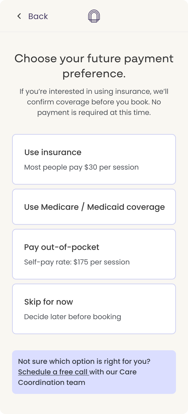
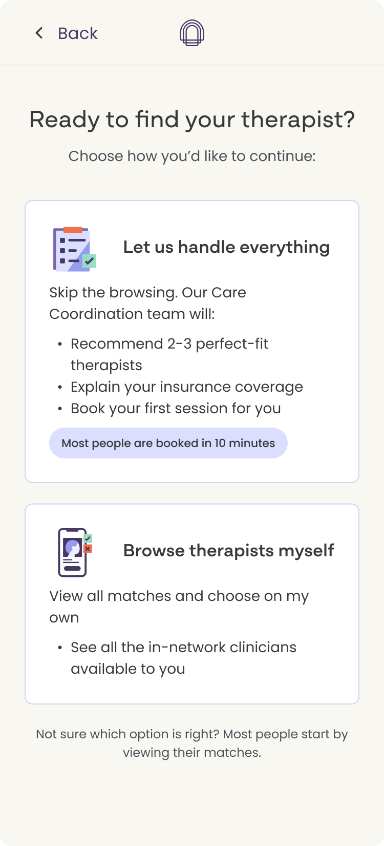
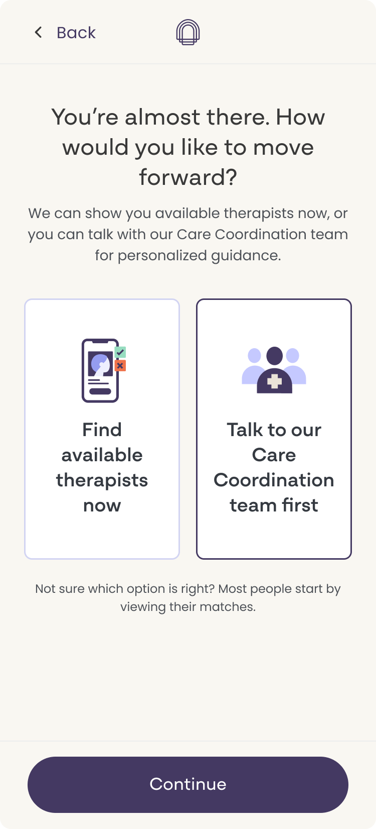
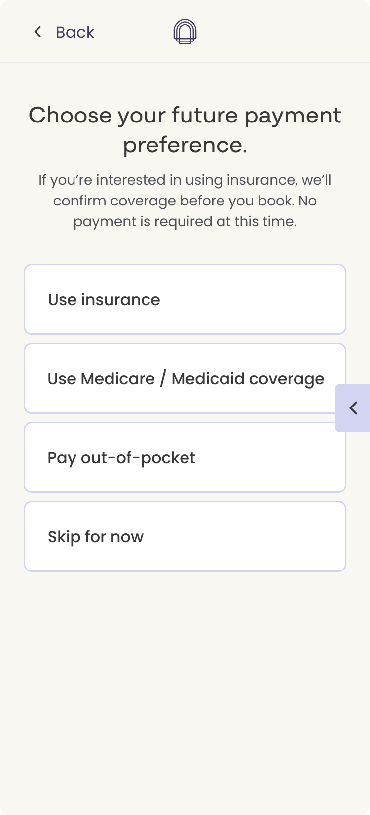
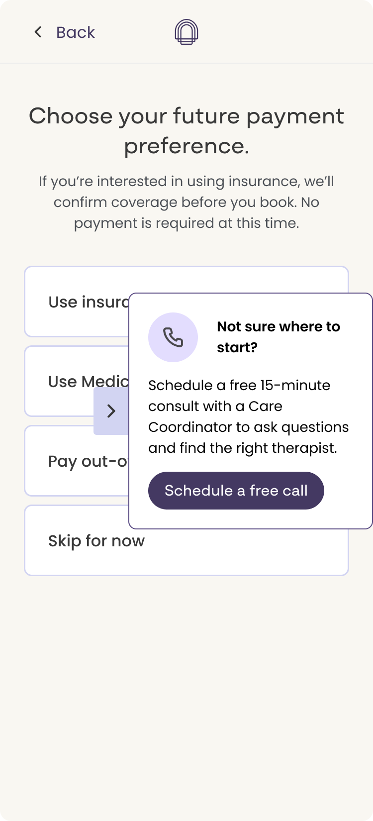
What shipped was one component layered over every page: wider reach, far less engineering. One contextual placement did survive, a banner for the free call after the first two therapist cards on the results page. I didn't agree with the rest of it. The overlay is awkward on mobile, and appearing everywhere means it isn't tuned to the moments where people actually hesitate. This is where the gap between what I designed and what shipped was widest.
What shipped was one component layered over the page (also available across the site). Time, development capacity, and a push from leadership landed us there, and the tradeoff was a real one: a single repeated component reached more users and asked far less of engineering. One contextual placement did survive: a banner for the free call after the first two therapist cards on the results page.
I didn't agree with the rest of it. The overlay is awkward on mobile, where it covers the content it's meant to support. And appearing identically on every page means it isn't tuned to the moments where someone is actually hesitating, which was the whole premise of the four placements above. Care coordination and leadership wanted it live, and I understand the urgency. Given time, I'd have tested the contextual prompt against the fork rather than shipping one treatment everywhere. This is the part of the project where the distance between what I designed and what shipped was widest.
| Metric | Before | After |
|---|---|---|
| Arrival to Lead | 2.76% | 8.6% |
Arrival to lead more than tripled, roughly a 212% lift, measured week over week from late February to late March.
The rate more than tripled, about a 212% lift, measured week over week from late February to late March.
After this version shipped, we monitored it, but the team's focus moved to other initiatives before I could push the next round. I had specific iterations queued: reworking how we asked the therapist preferences question, surfacing the full filter set in a modal on the results screen rather than making users hunt for it, adding a progress bar.