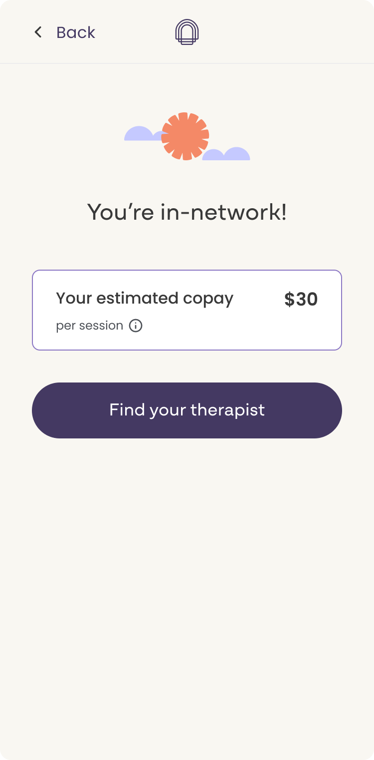
One of the most consistent friction points in Cerebral's insurance onboarding flow was also one of the most solvable: users didn't know what they'd pay until they were deep into checkout. By that point, the surprise cost was enough to push them out of the funnel entirely.
This project moved insurance cost estimates to the front of the experience, surfacing pricing information early enough to set expectations, reduce anxiety, and keep users moving toward booking. The feature launched in March 2026.
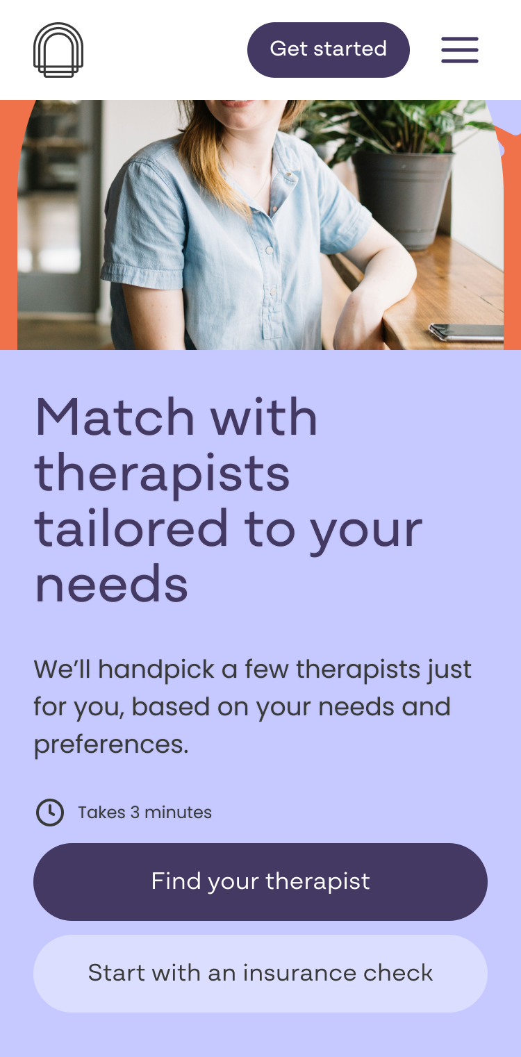
The entry point for Cerebral's therapy flow was cerebral.com/find-a-therapist. Before this project, the page had no cost estimate functionality. Users would begin browsing therapists with no sense of what their insurance would actually cover or what they'd pay out of pocket. That information only appeared later, deep in the checkout flow, long after a user had invested time finding a therapist they liked.
Drop-off data told the story clearly. The steepest abandonment in the search and schedule flow fell at the insurance question: the moment users were asked for their coverage details before receiving anything useful in return.
The pain points were consistent across multiple signals. Drop-off data showed users abandoning at the insurance step at a disproportionate rate relative to other steps in the flow. User recordings reflected confusion about what insurance covered, what the platform fee was for, and what out-of-pocket costs to expect. Competitive research confirmed that surfacing cost estimates early was already an emerging standard among digital health platforms, and Cerebral was behind.
Users weren't necessarily leaving because the price was wrong. They were leaving because they didn't know what the price was, and the uncertainty was enough to stall them.
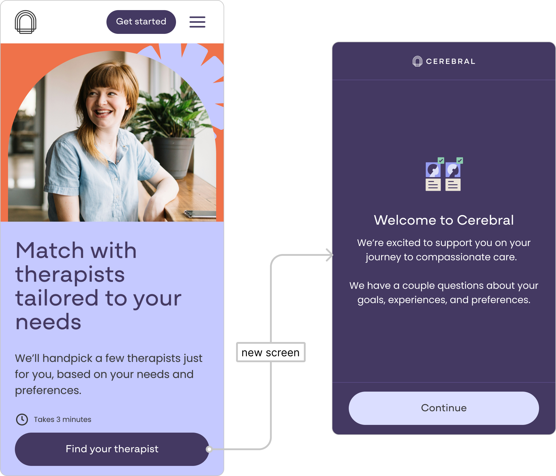
Before
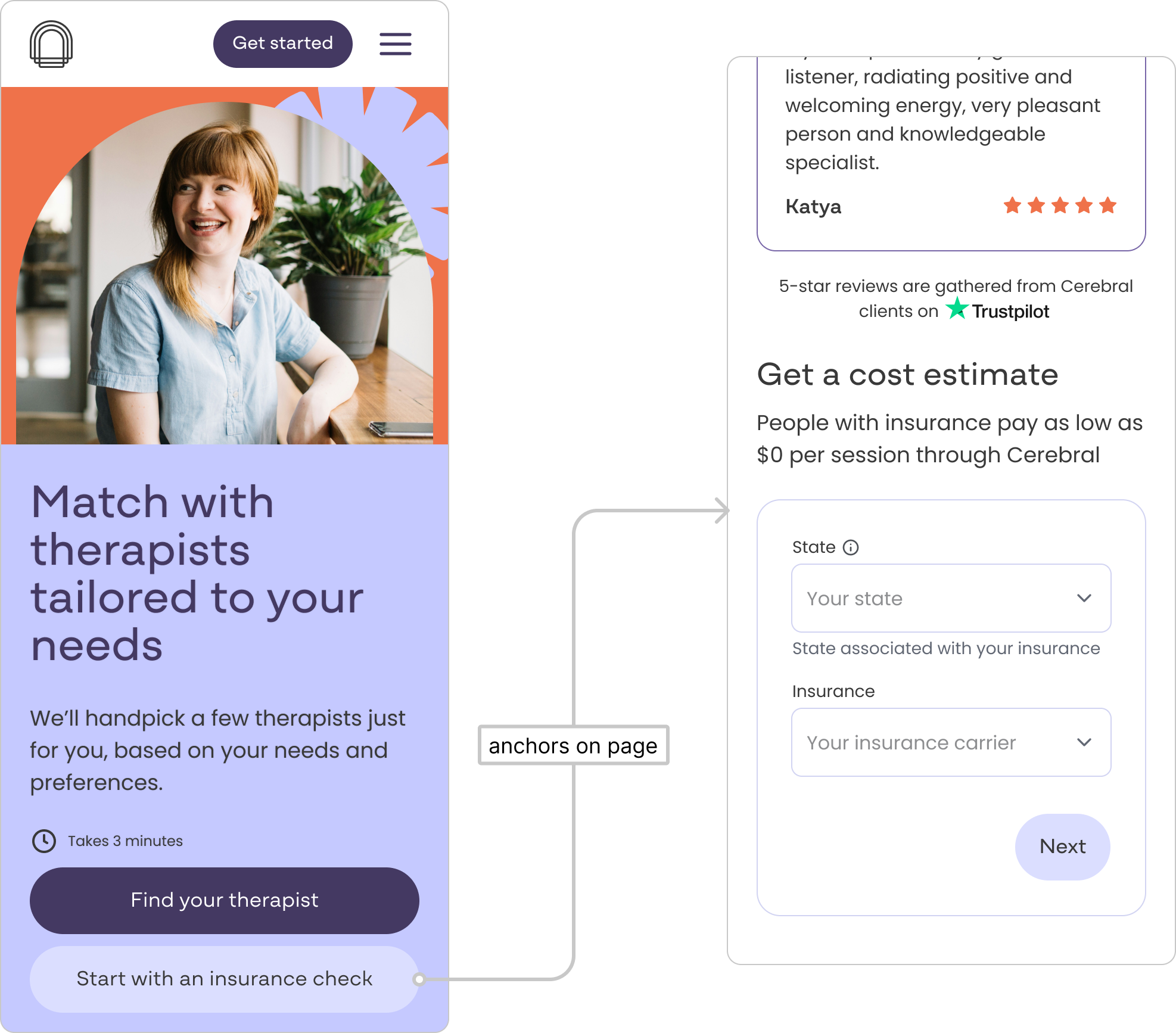
After
Sole product designer. I worked cross-functionally with a product manager, engineering, legal, and clinical operations across the full design lifecycle, from early discovery through final handoff. The entire project was scoped and delivered within a single two-week sprint.
Timeline
The project was scoped to one two-week sprint. That compressed window shaped design decisions from the start, including a deliberate choice to limit the number of response states in the first pass to reduce engineering lift, with a plan to expand them in future iterations.
Sohar integration
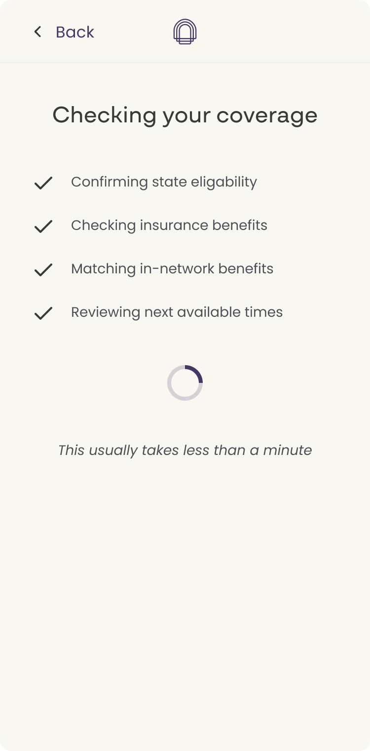
Cerebral was already using Sohar, a real-time insurance verification platform, deeper in the flow. This project brought that integration earlier in the experience, using a part of the Sohar product we hadn't tapped before. Competitors were already using Sohar in this way, which informed both the decision to pursue it and the confidence that it was technically feasible. What Sohar could reliably return shaped what we could responsibly surface: not exact figures, but directional estimates that were honest about their nature.
Legal review
Because we were surfacing cost-related language in a healthcare context, every response state went through rounds of legal review. Early versions used more specific cost ranges, but legal had concerns about stating figures we couldn't guarantee. I had to find copy that the compliance officer could approve, an engineer could build, and a user in a stressful moment could actually understand and trust. Those three constraints don't always point in the same direction.
The copy evolved significantly through that back-and-forth, landing on framing like "estimated copay," "avg copay per session," and "max estimated cost." Language that was honest about uncertainty while still giving users something concrete enough to act on.
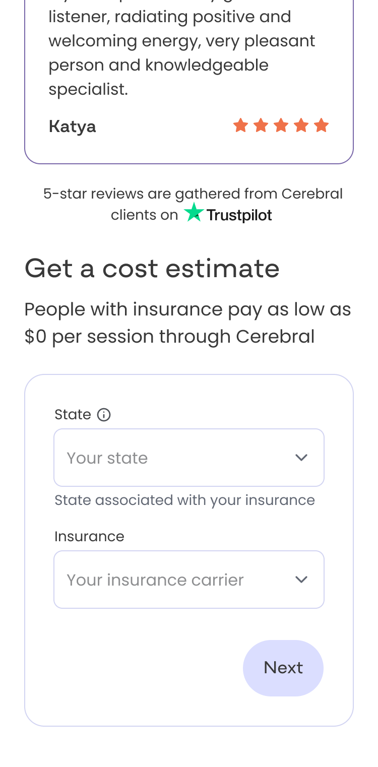
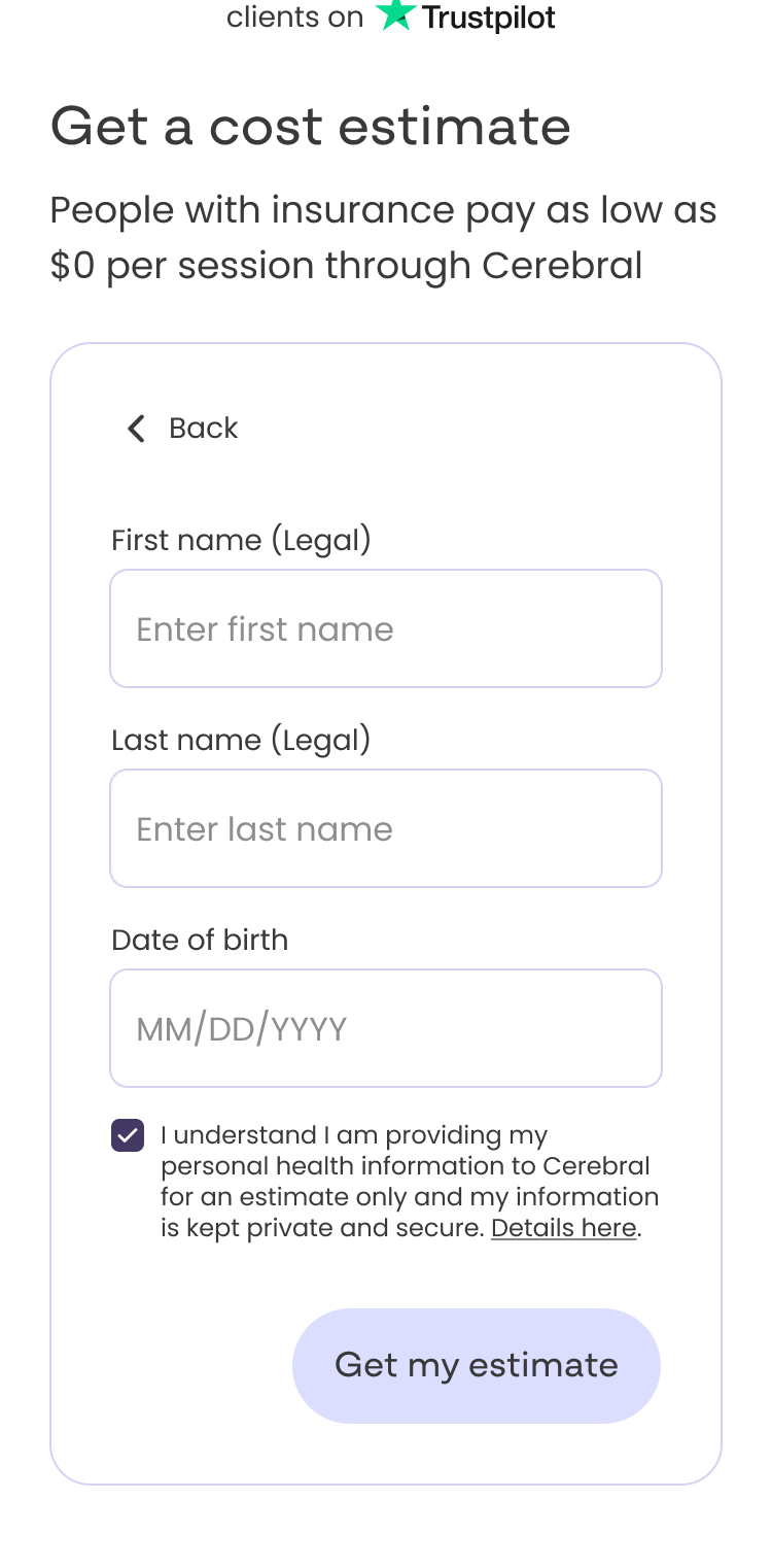
The "Get a cost estimate" entry point
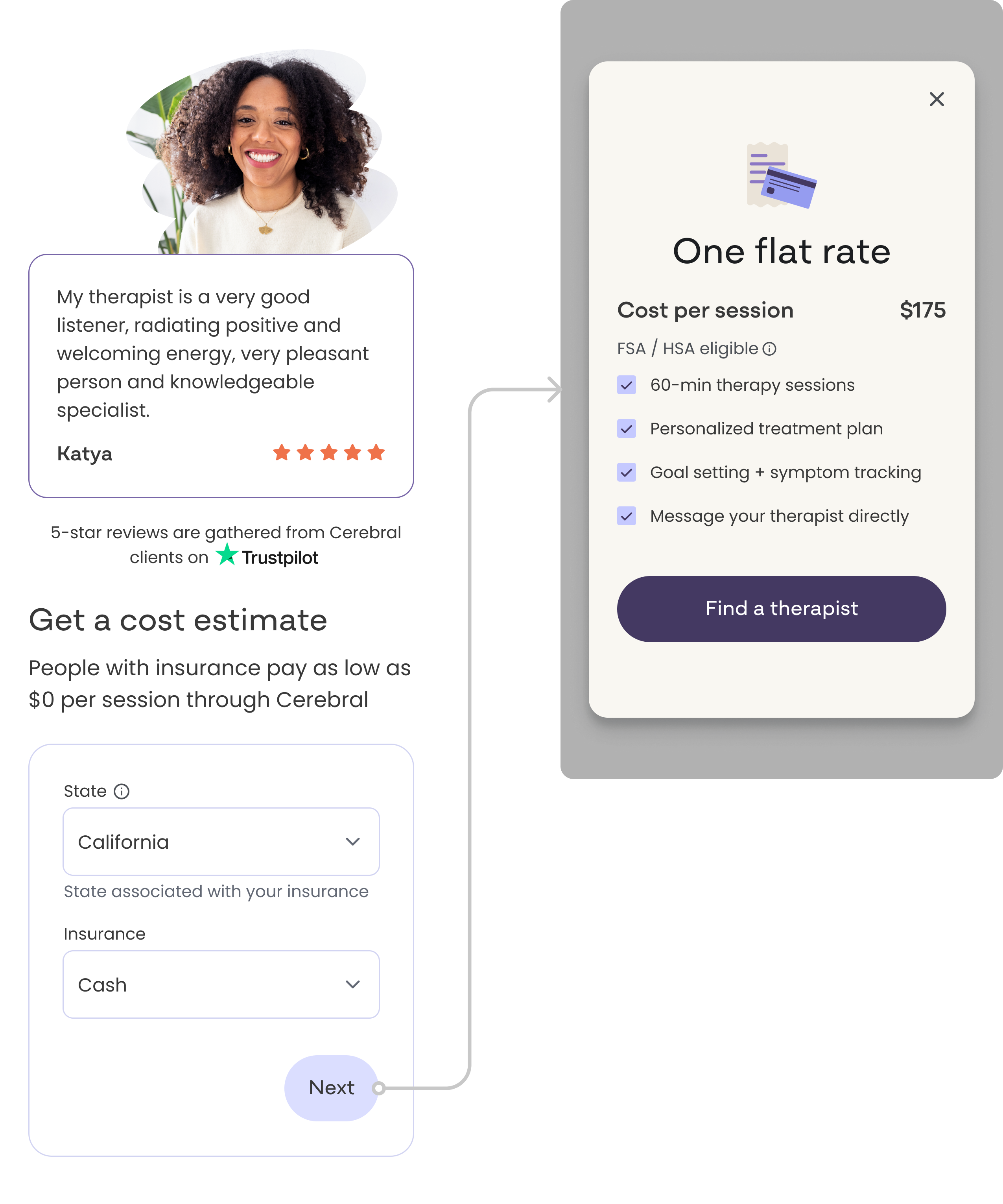
The centerpiece of the redesign was a short form added to the find-a-therapist page that asks users for their state and insurance information upfront. In return, they immediately receive a cost estimate before entering the full flow. This rebalanced the exchange: users give information and get something useful back right away, rather than being asked to commit before understanding what they'd pay.
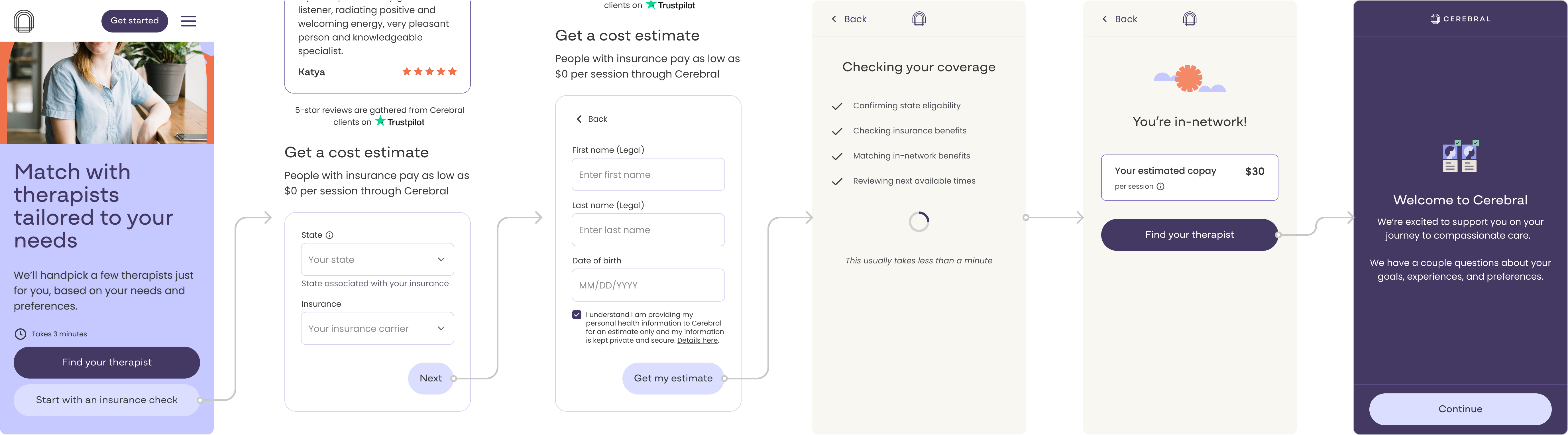
A full response state system
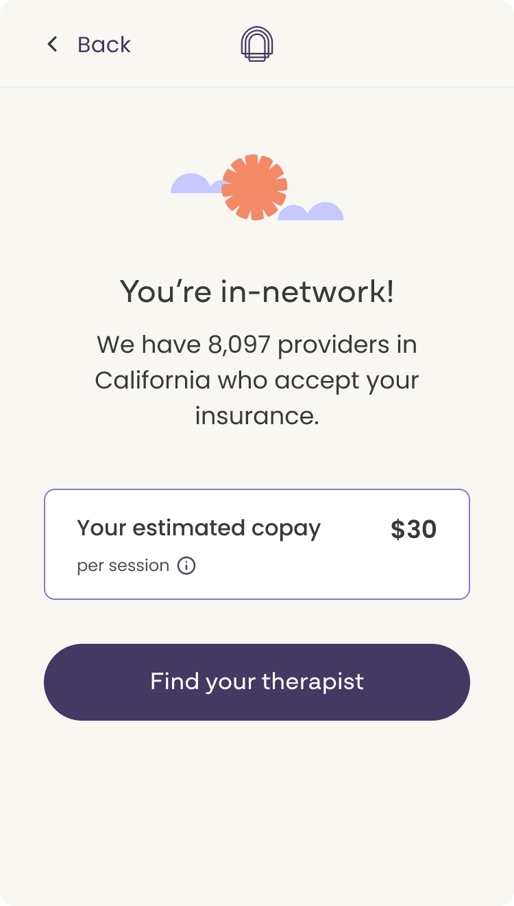
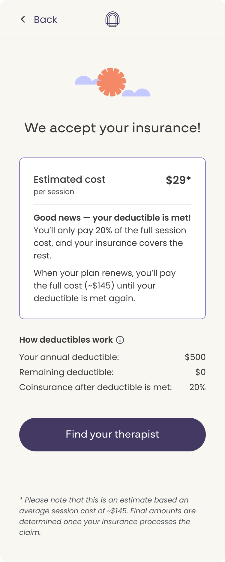
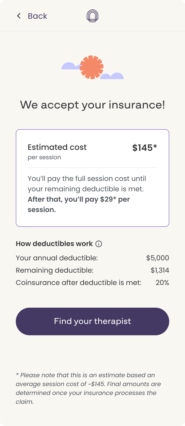
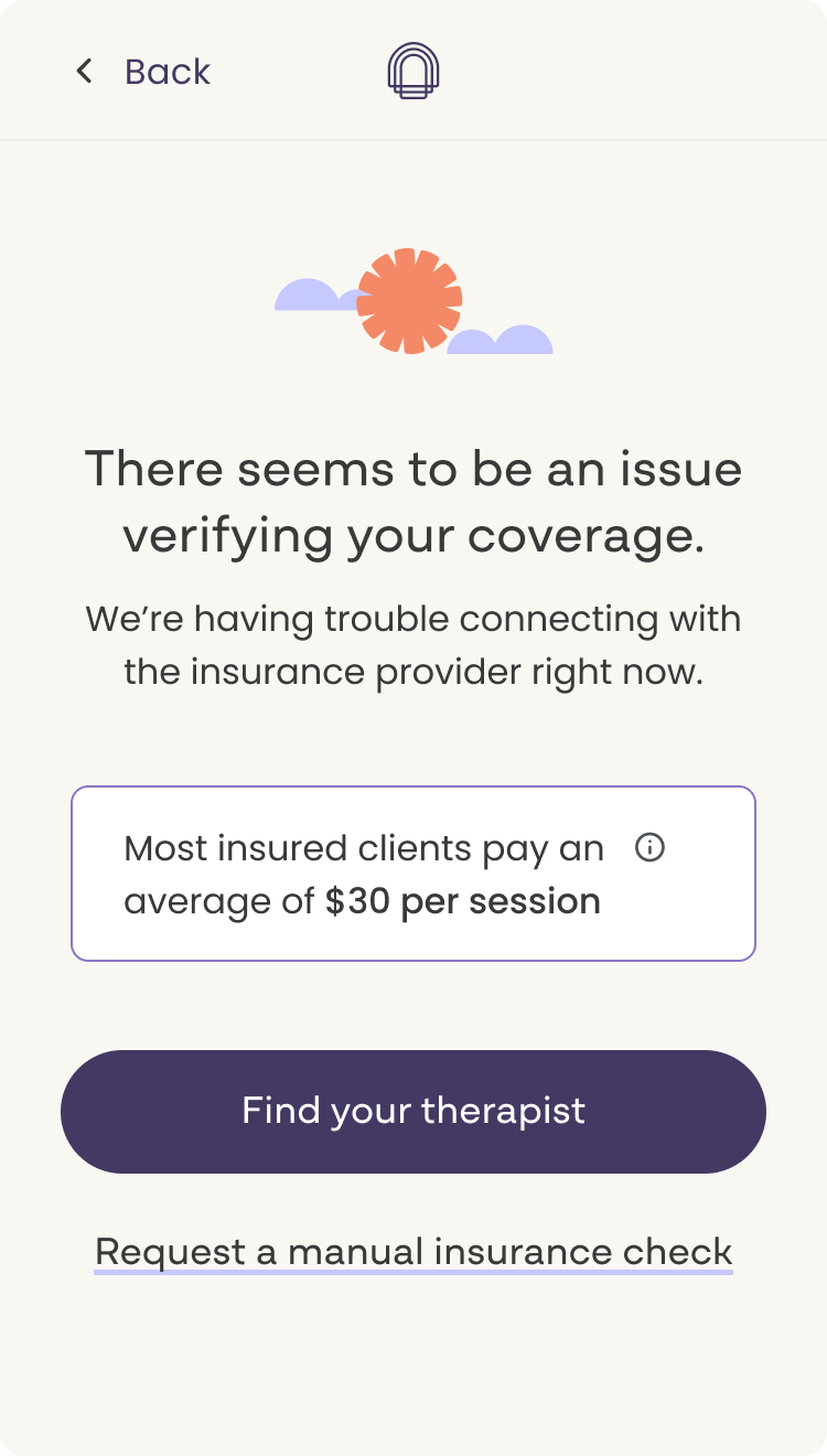
Because insurance data is never perfectly clean or complete, I designed five distinct response states to handle every possible outcome from the Sohar verification.
- In-network with copay: The clearest outcome. The user's insurance is accepted and we can show their estimated copay per session.
- Insurance accepted with deductible-based estimate: Insurance is accepted but the cost depends on where the user is in their deductible. The UI acknowledges this and provides an estimated cost based on typical deductible scenarios.
- Issue verifying coverage: Sohar returned incomplete or unverifiable data. The design communicates this transparently and keeps the user moving rather than creating a dead end.
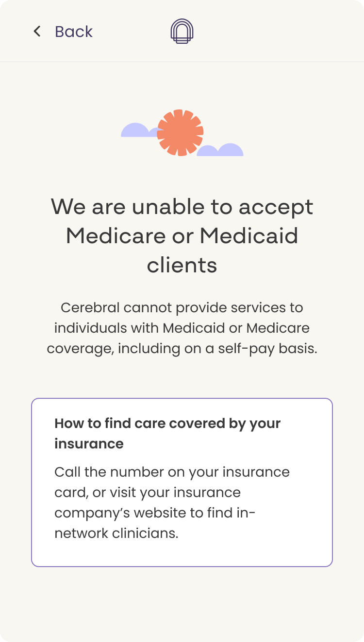
- Unable to accept Medicare or Medicaid: A specific, important edge case. The response is clear and direct, with a path forward rather than a hard stop.
- Cash pay: Users who selected cash pay bypassed the estimate entirely and were routed directly into the therapy intake questionnaire, removing unnecessary friction for users who already knew their path.
Designing for every state, not just the happy path, was a deliberate choice. A feature like this only builds trust if it handles the messy outcomes as well as the clean ones.
Copy and framing
The design challenge here was as much about language as layout. "Your estimated copay" vs. "max estimated cost" vs. "avg copay per session" each carries a different implication about certainty and what the user should expect. I worked closely with legal and the PM to define which framing belonged in which response state, and designed the UI to reinforce the right level of confidence without overpromising.
Responsive design
All screens were designed to scale across mobile and desktop without sacrificing clarity or usability at any breakpoint.
The bulk of iteration happened on the response screens. Early designs used more specific language and a broader set of response options than the first release could support. Legal pushed back on cost specificity. Engineering pushed back on the number of states scoped for the initial build. Both constraints led to tighter, more focused designs. The final screens are leaner than early explorations, and clearer for it.
Competitive analysis informed the project throughout. Because other platforms had already solved a version of this problem, I could reference existing patterns and focus design energy on how to adapt them to Cerebral's specific constraints and user context rather than starting from zero.
The feature launched the week I left Cerebral, so I don't have outcome data yet. What I'd want to measure first is whether each response state actually moves users forward into the full questionnaire. A screen that looks right but still creates drop-off tells you something important. I'd use heatmaps and funnel analysis to understand which states convert and which stall, then use that to inform whether the language can be pushed further with legal behind it. The constraints of this first version were real, but if data showed that more specific language meaningfully improved conversion, that's a conversation worth reopening with evidence.
The hardest parts of this project weren't the interaction problems. They were the language problems and the negotiation problems. Finding copy that satisfies legal, engineering, and a user in a vulnerable moment requires a different kind of design thinking than layout or flow, and it's the part of the work I found most interesting.
The two-week sprint constraint clarified priorities fast. Knowing we couldn't build everything in the first pass made scoping decisions easier: launch a focused, well-designed first version and expand from there. That discipline shows in the final product.
If I were to continue this work, I'd prioritize AB testing the response screens to understand whether more specific language like "you will not pay more than this amount" meaningfully changes user behavior. I'd also want to look at heatmap data across all five states to see where users hesitate or drop off before continuing into the questionnaire. The five screens we shipped feel right, but I'd want the data to confirm it.